-
Posts
1,330 -
Joined
-
Last visited
-
Days Won
1
iang last won the day on September 19 2012
iang had the most liked content!
About iang

Profile Information
-
Gender
Male
-
Location
Brighton
Recent Profile Visitors
7,198 profile views
iang's Achievements

Very Obsessed Member (5/9)
2.1k
Reputation
-
On the basis of the photo posted above, this seems a plausible interpretation. However, I've a slightly different photo of Southampton in Norway. An enlarged crop of this photo is posted below. I can't see any black other than may be just above the white? on the side of the hangar. Or is this the brown area? Assuming that the mid tone areas are A507c, there seems to be very little darker colour other than on the upper part of the hangar, an area on the side of the forward superstructure, and possibly part of X turret barbette. Or is most of this Green and the darker areas are shadow (other than on the hangar)? The difference in these two photos may be the result of film type and or the filters used. Orthochromatic film would darken any reds on the print compared with Panchromatic film. Brown would probably appear darker as a consequence. Conversely a red or orange filter with Panchromatic film would lighten reds on the print. A Union flag is helpful for making a judgement on film type, but none are visible.
-
I've not been able to access MfS' website for a few days. I get a DNS_PROBE_FINISHED_NXDOMAIN message on Chrome. Are they still around?
-
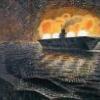
I can't see any white on either side. Notice that the Walrus is in overall aluminium dope, so the lightest colour appears darker than this on the starboard side photo posted above. I found some further footage of Rodney off Norway in IWM film ADM 670, at around 9.00 (and Nelson before this) https://www.iwm.org.uk/collections/item/object/1060008058 . Here's a screenshot:
-
jerry lloyd started following iang
-
very nice!
-
JW867 was lost in a barrier crash on April I, 1945 (not Thurston), so could not have been the aircraft Thurston was flying on April 13. There was an investigation into Thurston's loss on 13 April, but the Admiralty Reports do not give the identity of the Hellcat. According to the Admiralty Combat Reports, Thurston's usual aircraft for Iceberg I was JW741 (131/W), but this was not the aircraft he was lost in.
-
Lee, is this based on revisions to the current listing in FAA Aircraft, which identifies JX814 as Thurston's, not JX812?
-
An interesting question. Furious Albacore photos are not exactly common. The FAAM have very few from 822 Squadron. I have copies of two. 4L/BF609 along with the well-known photo of 4Q. 4L is in TSS with typical sweeping curve demarcation. Unlike 4Q, 4L has black codes outlined in white (I've no idea of the date). There are others filed as 822 Squadron at FAAM, but have 5x codes......
-
I spent a long time researching Seafox for the book. There are more photos around than I thought there would be. One of the things I did with each early FAA type was to catalogue the photos that I knew of after an initial visit to the FAAM. I did this for the Seafox in 2004, but stupidly didn't update it as I found more. Obviously, these notes are 20 years old and probably contain errors. The S/F XX numbers refer to the FAAM holdings in their main catalogue. However, most of their really interesting photos are the uncatalogued ones in donated private albums. SEAFOX PHOTOGRAPHS K4305 Prototype, Thetford and Aeromilitaria K8570 Camouflaged, equal size rectangular flash, Anglesey after minor mishap, Aeromilitaria K8573 S/F19, Aluminium HMS Orion; S/F20 Aluminium, alongside HMS Orion, SOC 2/5/39 K8575 S/F48 Aluminium coded L9B, 716sq HMS Neptune 1939, (FAAAUS, p.87); S/F4 Aluminium uncoded K8577 Aluminium uncoded, mishap hoisting aboard HMS Neptune (3 shots) in 1938 Aeromilitaria and SFAA p.37; S/F21 716 sq launching from HMS Neptune (also SFAA p.37); S/F49 aluminium coded L9A (repeat in centre upperwing); S/F8-13 702 sq HMS Pretoria Castle, undated but wavy undulating camouflage demarcation and narrow full length flash. Sturtivant FAA A/c gives HMS PC from 8/7/41?; S/F45 July 1941, Pretoria Castle, irregular but not wavy demarcation, but narrow full length demarcation. Compared with S/F8-13, looks very much like a partial repaint. S/F47 demarcation pattern as S/F45. K8578 S/F5 Aluminum, Sturtivant: accident HMS Neptune 5/10/37, SOC 24/5/39. Photo 77 Sturtivant fotofax. K8580 S/F50, Aluminium, coded 078. Sturtivant: hit pinnacle taxiing Kalafrana, 8/6/38, HMS Arethusa [also S/F16 and S/F1] K8582 S/F30, Launching from Ajax. Aluminium, Black fin with crest, serial repeat on rudder, prop warning markings from of floats. K8585 S/F25, aluminium, HMS Amphion 1938, SOC 24/11/42 (FAAA, p.203); S/F44 camouflaged with irregular demarcation (not wavy and note lower demarcation under tail than K8577). Rectangular equal size flash; S/F42 looks to be the same aircraft (judging by demarcation); S/F39 May 1941 (note sweeping curve of demarcation above lower wing). Also probably S/F41 K8586 Aluminium, Aeromilitaria K8591 S/F31 Aluminium, hoisted aboard ship (donor Windebank). No black fin or prop warning marks on float tips. Together with K8582 at Falkland Islands September 1939 (S/F34), but has black fin and tips to floats L4526 FAA 39-45, p70. HMS Asturias on catapult. Looks to be Aluminium. but with dark nose section (possibly black), or camouflaged with very high demarcation. Supposedly Coded ‘L’ (I 've not found a photo showing this). No underwing roundels, possibly rectangular flash. Sturtivant gives Asturias from 27.5.42. Also BNA, p.60. Hoisted aboard Asturias. Camouflaged with low demarcation and no black nose as is the picture in SFAA, p23 (serial clear). Maybe FAA 39-45 picture wrongly captioned? L4530 S/F 17 also FAA Camera. 733 sq Marking middle of rear fuselage (looks to be round circle underlined with white wings above) L4533 SFAA (1st) Camouflaged, rectangular flash. ‘B’ roundels `created by overpainting ‘A’ type (white showing through)? Possibly black undersides? Paint on fin and undersurface of rear fuselage Unknown S/F43: HMS Pretoria Castle, May 1941, demarcation looks like neither K8585 or K8577. S/F40 HMS Pretoria Castle, June 1941, demarcation looks like neither K8585 , K8577 nor S/F43. Good view of upper surface camouflage. S/F27-29 Mishap recovering to Ajax. I assume either K8582 or K8591, as a/c has black fin and warning markings on floats. I suspect that this is the unserviceable a/c at Battle of River Plate.S/F28 looks like the best chance of reading the serial on the original. S/F36 Sept 1939. Donated Flt Sgt Windebank (who also donated pictures of K8591). No black fin or tip to floats and serial appears to be xxxx3? Unknown ‘B’ HMS Canton, rectangular flash . Dymott p.25 Hope that helps.
-
This is K8585 being hoisted onto Pretoria Castle. I've a lot of photos of her Seafox, showing the evolution of camouflage over time. Notice in this photo that it carries an insignia on the starboard side, below and just ahead of the pilot's cockpit. I have a close up of this and it looks to be a skull over crossed cutlasses.
-
It isn't over until the fat lady sings. Cumberland arrived off Montevideo at 2200 on 14 December and Graf Spee's scuttling charges detonated at 2055 on 17 December. She was part of the Battle of the River Plate, even if she didn't fire a shot.
-
Possible with conversions: Ajax - Iron Shipwright/Commander Models resin kit Achilles - conversion from Ajax Cumberland - conversion from Trumpeter Kent (same sub-class) Graf Spee - Conversion from Very Fire De Moines to USS Salem (CA-139)😁 A Leander Class in plastic would make life a lot easier (and cheaper), of course. I'm hopeful that Ajax is on Trumpeter's future release schedule.
-
Sadly not. Gaga make a 1/700 Implacable, so I'd guess that a 1/350 won't be too long in coming. Tough job to convert Implacable to Indefatigable with this type of kit, because of the different arrangement of the boat decks.


