Ngantek Posted September 15, 2022 Share Posted September 15, 2022 As someone whose stash is about 90% FAA aircraft, I've been keen since getting back into the hobby, to settle on a combination of paints for Extra Dark Sea Grey and Dark Slate Grey for the Temperate Sea Scheme. What I've discovered, is that my perception of TSS (what I like) may or may not be historically accurate, and while one colour might seem bang on in isolation, it doesn't quite look the part, to my eye at least, when combined with its counterpart. For that reason, I've made a grid of different options for the two paints, which is below, to try and get a feel for not just the colours, but how they contrast against each other. Since my Handwriting is particularly dodgy, I'll go down the list: Dark Slate Grey: -Colourcoats ACRN06. Sprays beautifully, has a lovely decallable sheen. With ACRN02, it gives just a tad more contrast than I like (no doubt being pre-programmed with Humbrol from childhood) -Humbrol 224. I couldn't find the acrylic, so the enamel will have to do alone. I always felt the humbrol EDSG/DSG had a slight worn muddiness when combined. -XF13 - this was a speculative match-of-a-match-of-a-match. Clearly way out -XF73 - I've seen the XF73-XF77 combo quoted as a decent straight out of the pot Tamiya Match. I thought I'd check it out. -Been banging on about it for yonks, but @Casey posted some nice mixes here calculated from spectrophtometer measurements. Thanks Casey! EDIT: These were (incorrectly) mixed by mass rather than by volume however. Quote RAF012 - Dark Slate Grey - Flat Suggested using total of 5 parts (DE00: 0.41) XF-2 - Flat White: 3 XF-1 - Flat Black: 1 XF-4 - Yellow Green: 1 -Mr. Hobby Aqueous H421 (RLM81). This one was gleaned from @Phantome's excellent colour guides, which sadly can only be found from the web archive now. Quote their greenish interpretation of RLM 81 (H421/C[1]21) is a possible substitute I went with the former as it looked 'greener' in the pot to me* when buying. -Mr Color C012 Olive Drab (ANA613 version??); since it's apparently a good match to the Olive Drab used as a substitute colour for US built Aircraft. Extra Dark Sea Grey: -Colourcoats ACRN02. nuff said -Humbrol 123 enamel and Acrylic. I was amazed to find the acrylic sprayed beautifully with Vallejo thinners. I'm always hearing mumblings about the quality of these paints, but was surprised how well behaved it was. This was the dropper bottle version, not the pots or the new gen2 (which I don't think are out yet). The only downside is there's no obvious way to mix them nicely, being sealed and lacking a stirrer ball as they do. -XF24 lacks the blue tone, but I often see used as a substitute. -XF77/73, as above, has been quoted variously as a fair match using Tamiyas -Casey's mix. I might have overdone the blue; the ratios are quite skewed, meaning it can be hard to get the smaller components accurate without mixing up a large batch. I think I made about a gram or so. I have found this tends to a lighter, bluer 'faded EDSG' tone when mixing in the past too, however. EDIT: These were (incorrectly) mixed by mass rather than by volume however. Quote RAF009 - Extra Dark Sea Grey - Flat Suggested using total of 23 parts (DE00: 0.45) XF-2 - Flat White: 16 XF-1 - Flat Black: 4 XF-8 - Flat Blue: 2 XF-7 - Flat Red: 1 -Roy Sutherland's mix is oft-quoted. Quote To 50 parts of XF24 (dark grey), add 6 parts XF2 (white), and 3 parts XF8 (flat blue). I modify it for ease to 17 parts XF24: 2 parts XF2 : 1 part XF8. Incidentally, his DSG mix involves adding drops of colour to a whole bottle of XF22, which feels a little woolly to me, and in any case, I didn't want to do for the sake of a colour chip. -Gunze Aqueous and Lacquer H333 and C333. The H333 was overthinned and badly sprayed as you can see, these have worked out very close in colour and texture for me when used in the past. Caveats: -These were all airbrushed, thinned using their brand thinners. The exception is Humbrol, where I've used Colourcoats thinners for enamel, and Vallejo thinners for the acrylic. They are sprayed onto sheet styrene, that has been primed with Gunze Mr finishing surfacer 1500 grey. -You may notice some change in tone at the edges. This is because I wanted to cancel out the shine that the glossier paints might have, by applying a thin layer of Gunze GX113 flat varnish, which hopefully hasn't affected the colours too much. I retained the natural finish at the edges, since it's personally useful to gauge the finish for practical reasons (like whether one can apply decals straight). -The photo was taken in clouded daylight with a phone camera, hopefully giving a reasonable representation. -Of course, TSS also includes Sky type S and for biplanes, variously Sky Grey, Dark Sea Grey, Light Slate grey. Clearly, I've not compared these (although a Sky type S comparison is below for those interested), since I made this to help solve the particular issue of the top side camouflage, the combination of whose two colours I've found to be very sensitive when producing the overall 'look' *- I'm colourblind (deuteranomly (bad green receptor) for those interested. The most common one)! So really I have no idea what I'm talking about here, I can only make the grid, and pick what looks right to me. I'm not particularly bothered if that turns out to be red against neon orange! Hopefully however, the grid will be of use to people who can actually see green from brown. Discussion: I'd be interested to hear peoples' takes on these colours. For starters I can't really see the green in the DSG, so would be interested to hear a 'handwavium' description of the colours from someone who can. I personally like the scheme when the two colours are more similar in tone and somewhat desaturated to give a more subdued gradual fade. This may be a product of having used humbrols in my childhood. An example would be the Beaufort in the RAF Museum, Hendon, which I believe is over Azure Blue (although one of you is no doubt going to tell me that this isnt TSS!): Again I make no comment on the historical accuracy of this match, I just personally like it from a aesthetic point of view. To this end, Casey's mix, XF73 and H224 all look quite promising to me for DSG, but again I can't comment on the 'greenishness'. The Gunze choices both have too rich a saturated 'brownishness' to my taste, whatever that means. Maybe CaseyDSG and ACRN02 or XF77; or the XF77/73 combo both look nice. I know I like the Humbrol match, but don't particularly trust humbrols of recent, the lastest batch of enamel I purchased are very grainy and I've not really mastered them. Having said that, I was pleasantly surprised by the behaviour of the Humbrol acrylics, so perhaps will see (since there are signs that they're discontinuing these colours in enamel) if they bring them out in gen2 acrylic. I don't tend to like water based acrylics, but if they work like the H123 did, I'd happily take the results. Mixing paint types is something I tend to avoid, but have recently combined colourcoats and tamiya without any undue effects, so it's not something to rule out for me. Anyway I'd love to hear peoples' thoughts on what their favoured combinations are, these brands or otherwise. Cheers, Andy PS. Oh, here are the Sky-type S matches for anyone interested: 1:1 is 1part XF2 to 1part XF21 3 5 Link to comment Share on other sites More sharing options...
Casey Posted September 15, 2022 Share Posted September 15, 2022 3 minutes ago, Ngantek said: I might have overdone the blue; the ratios are quite skewed, meaning it can be hard to get the smaller components accurate without mixing up a large batch. I think I made about a gram or so. Just to make sure: Tamiya mixes are volume based, not mass based. 1 Link to comment Share on other sites More sharing options...
Ngantek Posted September 15, 2022 Author Share Posted September 15, 2022 2 minutes ago, Casey said: Just to make sure: Tamiya mixes are volume based, not mass based. Thanks, yeah I did mix by mass, on the hopeful assumption that they wouldn't vary too much in density. I'll have a go mixing by volume. Basically I'm too cheap to keep using up pipettes! Link to comment Share on other sites More sharing options...
John Laidlaw Posted September 15, 2022 Share Posted September 15, 2022 This is excellent, thank you. Good to hear about the Humbrol acrylics - hopefully they'll be keeping the colours that appear to be leaving the enamel range. With regard to Sky, Roy Sutherland's Tamiya mix is two parts XF-21 to three parts XF-2 - a touch lighter and less saturated than most. 1 Link to comment Share on other sites More sharing options...
Casey Posted September 15, 2022 Share Posted September 15, 2022 1 hour ago, Ngantek said: Thanks, yeah I did mix by mass, on the hopeful assumption that they wouldn't vary too much in density. I'll have a go mixing by volume. Basically I'm too cheap to keep using up pipettes! I can compare and see how much they differ, Tamiya is rather forgiving there. The fact they do not offer pure pigments is a boon in this case. Pure pigments differ a lot due to their physical properties. Example - Chromium Oxide Green is around 3.6x heavier than Quinacridone Magenta, Zinc white is 4.4x heavier than Diarylide Yellow and so on. 1 Link to comment Share on other sites More sharing options...
Ngantek Posted September 15, 2022 Author Share Posted September 15, 2022 10 minutes ago, Casey said: I can compare and see how much they differ, Tamiya is rather forgiving there. The fact they do not offer pure pigments is a boon in this case. Pure pigments differ a lot due to their physical properties. Example - Chromium Oxide Green is around 3.6x heavier than Quinacridone Magenta, Zinc white is 4.4x heavier than Diarylide Yellow and so on. Interesting. I didn't realise it could be so much. Entirely handwavium, xf8 does seem on the thin side, which would I suppose lead to overblue mixes. It is also one of the less muddy of the tamiyas. Sorry to misrepresent the mix, I'll remix and overspray when I get the chance to see how it changes. Link to comment Share on other sites More sharing options...
Ngantek Posted September 15, 2022 Author Share Posted September 15, 2022 1 hour ago, John Laidlaw said: This is excellent, thank you. Good to hear about the Humbrol acrylics - hopefully they'll be keeping the colours that appear to be leaving the enamel range. With regard to Sky, Roy Sutherland's Tamiya mix is two parts XF-21 to three parts XF-2 - a touch lighter and less saturated than most. Thanks. Yeah I'd forgotten this. I tend to agree with @Troy Smith, xf21 has a muddiness that can't be cleared with just white. I quite like Casey's mix and colourcoats, again just a matter of taste. Here's hoping on Humbrol, it's a shame to see so many colours go from the enamel range if rumours are true. I did pick up another tin of each anyway! 1 Link to comment Share on other sites More sharing options...
Casey Posted September 15, 2022 Share Posted September 15, 2022 7 minutes ago, Ngantek said: I didn't realise it could be so much. Here is an example density chart: https://justpaint.org/wp-content/uploads/2019/05/PIGMENT-SPECIFIC-GRAVITY_jpechart.pdf 1 Link to comment Share on other sites More sharing options...
John Laidlaw Posted September 15, 2022 Share Posted September 15, 2022 2 hours ago, Ngantek said: I quite like Casey's mix and colourcoats, again just a matter of taste. I am having problems with Casey's mixes, simply because I am finding it difficult to come up with repeatable portion sizes and the results are therefore skewed. I will break down eventually and get a pipettor. 1 Link to comment Share on other sites More sharing options...
Ngantek Posted September 15, 2022 Author Share Posted September 15, 2022 16 minutes ago, John Laidlaw said: I am having problems with Casey's mixes, simply because I am finding it difficult to come up with repeatable portion sizes and the results are therefore skewed. I will break down eventually and get a pippetor. Yeah I tend to mix up at least a good chunk of a 10ml bottle; but generally inherent in that is that it's a colour you'll use a reasonable amount of over time. I find mixing enough of a faff, that I'd rather waste paint than have to do it multiple times unnecessarily. Added to that, I assume each mix will come out at least slightly differently, so I'm keen to make sure any further coats or repair work come from the same original mix. But yeah I've been weighing them, so don't listen to me! 1 Link to comment Share on other sites More sharing options...
John McNamara Posted October 26, 2022 Share Posted October 26, 2022 Boy, this whole subject is a can of worms. I spent 40 years in the printing industry so I know some things about subtractive colour mixing and matching. It used to keep me up at night, quite literally, stood at the end of a press at 3 in the morning with a customer, trying to match colour. I am not going to comment on the specifics of the posts above, but rather just make a few points that members should know before going too far down the rabbit hole. This concerns matching colours from say a photo to a museum example or a model. Lets start with subtractive mixing (paint, ink etc): The light source and its colour temprature is all important. If you are trying to compare using differing light sources you are wasting your time. In an ideal world you should be viewing colours you are trying to assess, mix or match under a 6500 K light source, approximating to midday on a summers day. If you are under electric light (almost certainly will be), what type is it because many will give a colour cast? As examples, old incadescent lamps gave a red cast, and flourescents give a green cast. Therefore if you have a colour you want to check against an indoor museum exhibit, take it with you and do a direct comparison. It will be easier in daylight. Colour photographs may well distort the hues of the colour you are seeking to replicate. The light source at the time of taking the photograph will make a big difference. Photograpers who make photos for the printing industry go to great lengths to ensure that their images have colour integrity. All colours mixed together give you a very dark grey or brown, but almost black. In the case of additive mixing (light): Everything is reversed that you think you have known from a child. So, on a monitor, red and green mixed produce yellow! All the colours mixed togethe rin equal proportions produce white. Most monitors will not provide and accurate colour hue. If you want the most accurate look at something like the Eiko Colouredge range that are designed for photoeditors. Even then, a online colour guide is not 100% accurate. It it is what it says it is, a guide. I will not need to tell anyone here that the substrate that you put the colour on makes a big difference to hue and shade, and so does the underpinning with other colours, and the desinsity of the layer applied. Also the type of paint or combination of paint layers. If you want to know what colour a paint is, get a colour sample, preferably painted on to the same substrate you are going to use. Like I said, a can of worms! John 1 1 Link to comment Share on other sites More sharing options...
Casey Posted October 26, 2022 Share Posted October 26, 2022 (edited) 3 hours ago, John McNamara said: Boy, this whole subject is a can of worms. I spent 40 years in the printing industry so I know some things about subtractive colour mixing and matching. It used to keep me up at night, quite literally, stood at the end of a press at 3 in the morning with a customer, trying to match colour. I am not going to comment on the specifics of the posts above, but rather just make a few points that members should know before going too far down the rabbit hole. This concerns matching colours from say a photo to a museum example or a model. Lets start with subtractive mixing (paint, ink etc): The light source and its colour temprature is all important. If you are trying to compare using differing light sources you are wasting your time. In an ideal world you should be viewing colours you are trying to assess, mix or match under a 6500 K light source, approximating to midday on a summers day. If you are under electric light (almost certainly will be), what type is it because many will give a colour cast? As examples, old incadescent lamps gave a red cast, and flourescents give a green cast. Therefore if you have a colour you want to check against an indoor museum exhibit, take it with you and do a direct comparison. It will be easier in daylight. Colour photographs may well distort the hues of the colour you are seeking to replicate. The light source at the time of taking the photograph will make a big difference. Photograpers who make photos for the printing industry go to great lengths to ensure that their images have colour integrity. All colours mixed together give you a very dark grey or brown, but almost black. In the case of additive mixing (light): Everything is reversed that you think you have known from a child. So, on a monitor, red and green mixed produce yellow! All the colours mixed togethe rin equal proportions produce white. Most monitors will not provide and accurate colour hue. If you want the most accurate look at something like the Eiko Colouredge range that are designed for photoeditors. Even then, a online colour guide is not 100% accurate. It it is what it says it is, a guide. I will not need to tell anyone here that the substrate that you put the colour on makes a big difference to hue and shade, and so does the underpinning with other colours, and the desinsity of the layer applied. Also the type of paint or combination of paint layers. If you want to know what colour a paint is, get a colour sample, preferably painted on to the same substrate you are going to use. Like I said, a can of worms! John I fully agree with all you wrote there. Here is how I am trying to mitigate them: Light source: Always use same light source in my spectrophotometer, D65 is de facto standard choosen by paint industry. References: Original paint samples, like BS of FS documents, or very reputable sources like British Museum book for WWII RAF colors. Also measured on same spectrophotometer using same settings. Colour photograph is not a useful source. Additive light mixing: Simply no. All my math is done in K/S space (absorbtion/scattering). I do convert result to standard sRGB for visualisation purposes but I never touch RGB in my math. Substrate: I always measure paints and mixes on standard paint drawdown charts with (if possible), same paint thickness, or at least thick enough to have opacity >95% (opacity can be directly measured as readout difference between black and white substrate in drawdown charts) It is can of worms, but mixing own paint is fun if you have way to objectively compare them to references. I made math for Tamiya because they are popular but since they dont offer primary pigments the matches are more metameric than pure pigment ones (means: they match in D65 light but may be differ in different light conditions). Now I want to work on TSS more I miss the good source comparison on @Ngantekpost, like the one I mentioned before - British aviation colours of World War Two. Edited October 26, 2022 by Casey 2 1 Link to comment Share on other sites More sharing options...
John McNamara Posted October 27, 2022 Share Posted October 27, 2022 Interesting book if you can get a copy. A rather expensive one too. 🙂 Link to comment Share on other sites More sharing options...
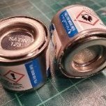
Casey Posted October 27, 2022 Share Posted October 27, 2022 (edited) Here is my attempt: End results first, here are the scans of drawdowns of my most recent mixes over the British Aviation Colours of World War Two insert: Here are spectrophotometer readouts, comparing my mixes to the source color: And here are recipes I've calculated and used. It is raw output of my math simulation, red curve is the theoretical math, blue is the target color. Recipe is in the box. I've mixed paints colors using Golden Fluid Acrylics - https://goldenpaints.com/products/colors/fluid. I have them measured best so far and I can reliably get my real mixes close enough (~1.0DE) of the target. I've aimed for 3ml of each paint, which is not that much but it is enough for 1/72 scale model. I've used the cheap scales from Amazon, they cost around 15$. This solves my problem of precise mixing of small masses - since my recipes for this paint call for MASS. And here are the paint pots I'm usually using. They are around 20$ per 600 and contain 3ml, which is perfect for small volume mixes (and all 1/72 model needs really). @John McNamara Yep it is very interesting book! Wish there was some good quality reprint of those! @stevehnz - if I remember correctly, you asked (long time ago) if there are any differences between blue and green versions of the book - the answer is: no. Colors are the same with small exception of Aluminium where the difference is mostly in texture. Edited October 27, 2022 by Casey 5 3 Link to comment Share on other sites More sharing options...

Recommended Posts
Create an account or sign in to comment
You need to be a member in order to leave a comment
Create an account
Sign up for a new account in our community. It's easy!
Register a new accountSign in
Already have an account? Sign in here.
Sign In Now