binbrook87 Posted June 14, 2022 Share Posted June 14, 2022 (edited) Hello all. As I was finishing another model in the USAF SEA camo scheme, while scouring photos for reference I have noticed that the dark green FS34079 seems to be very variable. Anything from a medium green, to darkish olive and on some aircraft almost a black green. This is especially notable on later F-4s. Do you know if there were different colour paints applied in the field as I can't imagine this much variation was due to weathering? Thanks in advance for your thoughts. Edited June 14, 2022 by binbrook87 Link to comment Share on other sites More sharing options...
Casey Posted June 14, 2022 Share Posted June 14, 2022 2 hours ago, binbrook87 said: Hello all. As I was finishing another model in the USAF SEA camo scheme, while scouring photos for reference I have noticed that the dark green FS34079 seems to be very variable. Anything from a medium green, to darkish olive and on some aircraft almost a black green. This is especially notable on later F-4s. Do you know if there were different colour paints applied in the field as I can't imagine this much variation was due to weathering? Thanks in advance for your thoughts. Here is snapshot from my databases containing FS34079. 2 Link to comment Share on other sites More sharing options...
Greg B Posted June 14, 2022 Share Posted June 14, 2022 3 hours ago, binbrook87 said: Hello all. As I was finishing another model in the USAF SEA camo scheme, while scouring photos for reference I have noticed that the dark green FS34079 seems to be very variable. Anything from a medium green, to darkish olive and on some aircraft almost a black green. This is especially notable on later F-4s. Do you know if there were different colour paints applied in the field as I can't imagine this much variation was due to weathering? Thanks in advance for your thoughts. Aircraft were stored outside in all weathers and subjected to a harsh tropical sun. Add to that intermittent cleaning, paint batches, repainting, replacement aircraft, smoke pollution and people walking on them and the FS colours should be considered to be just a starting point. That’s before you even get to the colour reproduction properties of camera films and the processing. Top tip is to pick your subject, find a photo and paint to that for accuracy. 8 1 Link to comment Share on other sites More sharing options...
Mycapt65 Posted June 15, 2022 Share Posted June 15, 2022 I've tried doing a few planes in USAF SEA schemes and what I found out is more important than getting the right colors, is getting the right contrast. The tan and light gray is easy. Now the greens are tricky. All too often when using the "correct" colors there's too little contrast between them and all you see is a green and tan airplane. I recommend that you do plenty of side by side test shots of the different greens using your prescribed demarcation style. Good luck 2 2 Link to comment Share on other sites More sharing options...
Steben Posted June 15, 2022 Share Posted June 15, 2022 6 hours ago, Greg B said: Aircraft were stored outside in all weathers and subjected to a harsh tropical sun. Add to that intermittent cleaning, paint batches, repainting, replacement aircraft, smoke pollution and people walking on them and the FS colours should be considered to be just a starting point. That’s before you even get to the colour reproduction properties of camera films and the processing. Top tip is to pick your subject, find a photo and paint to that for accuracy. All colours are a starting point. Especially on aircraft and small scale. 1 Link to comment Share on other sites More sharing options...
Steben Posted June 15, 2022 Share Posted June 15, 2022 1 hour ago, Mycapt65 said: I've tried doing a few planes in USAF SEA schemes and what I found out is more important than getting the right colors, is getting the right contrast. The tan and light gray is easy. Now the greens are tricky. All too often when using the "correct" colors there's too little contrast between them and all you see is a green and tan airplane. I recommend that you do plenty of side by side test shots of the different greens using your prescribed demarcation style. Good luck Fresh restored aircraft 1:1 do have low contrast between greens. SEA scheme but German norm 83 as well, where fs34102 is swapped for the close ral6003. 1 Link to comment Share on other sites More sharing options...
binbrook87 Posted June 15, 2022 Author Share Posted June 15, 2022 Here are some examples. First is what i would class as 'straight from the tin' 34079 https://commons.wikimedia.org/wiki/File:McDonnell_F-4D_Phantom_II,_USA_-_Air_Force_AN0817246.jpg Then a very dark version....... https://www.tinker.af.mil/News/Article-Display/Article/1240944/tinker-history-mcdonnell-douglas-f-4-phantom-ii/ Then the same 34079 green as part of Euro 1....can it really be the same colour? https://www.deviantart.com/f16crewchief/art/Jayhawk-F-4D-in-European-1-Scheme-No-2-798874937 This is why i love modelling! 😁 Link to comment Share on other sites More sharing options...
Giorgio N Posted June 15, 2022 Share Posted June 15, 2022 Well, FS 34079 is a pretty dark paint, so no surprise if this looks quite dark in pictures. Really when it comes to freshly painted aircraft this paint does not seem to me to have changed much over the years when used in the SEA scheme and the variations seen in pictures are within what I'd consider normal within different production batches. Of course there is the possibility that some batch was particularly different from the others for some reason (like in the infamous 3-green Phantoms) I've checked a few pictures on a number of books dedicated mainly to SEA painted Phantoms and to my eyes most of the variations are actually due to the different lighting and colour components of the various pictures, meaning that film type, exposure and so on are probably more important than any actual difference in the paint itself. Of course once applied the paint started to suffer all kind of weathering effects. later Phantoms would have likely been aircraft kept in better condition after their latest repaint compared to those based in Vietnam and this can have an effect. Regarding the paint used in the European 1 scheme, all these were of "Gunship Quality", meaning amongst other things that they were particularly matt. I'll leave it to others to explain the physics of it but in general the level of sheen affects our perception of how dark or light a paint is 2 Link to comment Share on other sites More sharing options...
iainpeden Posted June 15, 2022 Share Posted June 15, 2022 27 minutes ago, Giorgio N said: Regarding the paint used in the European 1 scheme, all these were of "Gunship Quality", meaning amongst other things that they were particularly matt. I'll leave it to others to explain the physics of it but in general the level of sheen affects our perception of how dark or light a paint is Phantom colours - my favourite! As to @Giorgio N point on the physics. At an air show at Alconbury in the early '80s there were 3 F-4Es side by side. The gray on the two SJ a/c was a charcoal ultra matt, that on the SP a/c almost a satin (RAF) dark sea grey. I researched this, was put in touch with the person who had painted the SP a/c at Kemble and in his view it was down to the differing pressures used in the spray gun. @Greg Bpoint about the effects of climate, dirt etc on colour is very valid; if you look at the tan in the SEA scheme it can go from a medium sandy shade to a dark earth. The third link provided by @binbrook87 of the Jayhawk F-4D is very interesting. It's the first time I have seen a picture where the upper part of the radome has been over sprayed with the green - obviously not a temporary job because the anti-static stencils have been applied on top of it Link to comment Share on other sites More sharing options...
binbrook87 Posted June 15, 2022 Author Share Posted June 15, 2022 Some great replies here guys...very interesting reading and thanks! I guess the moral of the story like somebody has said already is to pick an actual airframe and match the colours to that as close as possible. Regarding the Euro 1 grey i have also heard that story (probably on BM) about the Kemble spraying pressure. Also though wasn't the grey originally the darker 36118 before later changing to the more common 36081? I could be wrong but if you look at some ANG and AFRES C and D models you can see the differences. Link to comment Share on other sites More sharing options...
Steben Posted June 15, 2022 Share Posted June 15, 2022 Gloss paint wears to satin. Flat wears to satin. And both discolour. Link to comment Share on other sites More sharing options...
Mycapt65 Posted June 15, 2022 Share Posted June 15, 2022 (edited) 5 hours ago, Steben said: Fresh restored aircraft 1:1 do have low contrast between greens. SEA scheme but German norm 83 as well, where fs34102 is swapped for the close ral6003. Yes I understand that there's little contrast between the two greens. Still some paint brands have yet too little contrast. It's especially aggravated with too soft a demarcation. I'm just recommending to test first before going all in. Also keep in mind scale effect. This is another prickly subject that I adhere to. Ymmv. Enjoy your build. Do it how you like it. This is supposed to be fun Ron Edited June 15, 2022 by Mycapt65 Link to comment Share on other sites More sharing options...
iainpeden Posted June 15, 2022 Share Posted June 15, 2022 There's been much discussion and a lot written about the variation in paint color (sic), in particular olive drab, that was produced by different factories and applied to USAAF a/c during WW2. I wonder if there is a similar situation here given the huge amount of paint that must have been needed to cover the Phantoms. To add to this; are the SEA color variations so noticeable of other a/c? Maybe @Dana Bell could help out? Link to comment Share on other sites More sharing options...
Slater Posted June 15, 2022 Share Posted June 15, 2022 Looking at old photos of Vietnam War aircraft, the 30219 Tan seems to vary from a light brown to a golden tan. Link to comment Share on other sites More sharing options...
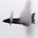
Finn Posted June 15, 2022 Share Posted June 15, 2022 Here are 3 F-4s in SEA showing variations in the paint: even touch up paints quite didn't match: Jari 4 Link to comment Share on other sites More sharing options...
JosephLalor Posted June 15, 2022 Share Posted June 15, 2022 I've long since forgotten how, but I'd formed the impression that some Phantoms may have had a darker green, perhaps FS 34052. I don't know how likely that is, if at all. Also, I'm intrigued by the fiscal year part of the tail code. Am I mistaken in wondering if that aircraft was really funded by the 1940 budget? I'm thinking also of AF37 on Charles Olds' aircraft. Link to comment Share on other sites More sharing options...
Finn Posted June 15, 2022 Share Posted June 15, 2022 1 hour ago, JosephLalor said: Also, I'm intrigued by the fiscal year part of the tail code. Am I mistaken in wondering if that aircraft was really funded by the 1940 budget? I'm thinking also of AF37 on Charles Olds' aircraft. They would be: 64-0679 63-7xxx Jari 1 Link to comment Share on other sites More sharing options...
Ben Brown Posted June 16, 2022 Share Posted June 16, 2022 Just to add to the fun, Pacific Air Forces (PACAF) had a different numbering system than the rest of the Air Force. PACAF used the system as described by Finn, while the rest of the Air Force went with the last two of the year plus the last three of the serial. So, 64-0679 would be 66-679 if it were flying out of Lakenheath or Nellis. Ben 1 Link to comment Share on other sites More sharing options...
CT7567 Posted June 16, 2022 Share Posted June 16, 2022 On 6/15/2022 at 5:58 AM, binbrook87 said: Regarding the Euro 1 grey i have also heard that story (probably on BM) about the Kemble spraying pressure. Also though wasn't the grey originally the darker 36118 before later changing to the more common 36081? I could be wrong but if you look at some ANG and AFRES C and D models you can see the differences. I believe 36118 (sometimes incorrectly/informally known as "Gunship Gray") was indeed used in some of the experimental A-10 schemes that led to the "European I" camouflage, but FS 36081 is the darker of the two* and was the first gray used in the official scheme. There were variations that evolved later using 36118 instead, most notably on the MAC fleet (C-5s, C-130s, C-141s, et al) due to concerns the darker 36081 was contributing to cabin overheating on the cargo types. *The FS 595 designation system always uses the first number for finish (1= gloss, 2= semigloss/fluorescent, 3= matte), the second for hue (1= red, 2= orange, 3= yellow, etc, 6 designating grays), and the last 3 digits indicate reflectance, in oversimplified terms meaning how much light the specific color reflects or absorbs. Thus a darker color will generally have a lower "last three" than a lighter one. So 36081 is darker than 36118, both of which are much darker than (for example) 36375 (aka Light Ghost Gray). 1 1 Link to comment Share on other sites More sharing options...
Steben Posted June 16, 2022 Share Posted June 16, 2022 On 15/06/2022 at 00:56, Casey said: Here is snapshot from my databases containing FS34079. Astonishing the spread in waves is the same, but the lightness of the AMS595A higher... Link to comment Share on other sites More sharing options...
Casey Posted June 16, 2022 Share Posted June 16, 2022 3 hours ago, Steben said: Astonishing the spread in waves is the same, but the lightness of the AMS595A higher... Mind the scale. The the total difference is around 3.0DE. The L* correspond to perceptual brightness and the difference is much less than so called 'scale factor' used by many (it is in fact comparable to 1/32 scale factor suggested by Merrick & Hitchcock. Fun fact, the RLM82 there on page 7 has values of: L=32.39, a-3.8, b=6.96. Compare it to FS34079 of 32.11, -3.23 and 7.38 And for 1/72 scale the same RLM82 is quoted as: 39.23, -7.65, 6.13. Adding white pigment does increase chroma (saturation of a color) up to a certain point. May be counter intuitive, but it is real. 1 Link to comment Share on other sites More sharing options...
Julien Posted June 17, 2022 Share Posted June 17, 2022 The Tan could fade considerably as well, repainted splitter plate. 1 Link to comment Share on other sites More sharing options...
Greg B Posted June 17, 2022 Share Posted June 17, 2022 On 16/06/2022 at 02:52, Finn said: Here are 3 F-4s in SEA showing variations in the paint: even touch up paints quite didn't match: Jari The touch ups won’t match. The original green has sun faded and oxidised/degraded. You can see that in the scrapes and scratches where it would have been brushed and rubbed against by the blokes doing the corrosion control. It was very common for the British Army Land Rover Wolf fleet with the later IR green paint to see the same effect. It would fade to a grey/greenpastel type shade (like the photo posted by Julien above this) after a couple of years. The vehicles were not repainted as often because H&S concerns made it a right pain in the backside so the vehicles spent longer between touch ups. 1 Link to comment Share on other sites More sharing options...
Steben Posted June 17, 2022 Share Posted June 17, 2022 (edited) 9 hours ago, Casey said: Mind the scale. The the total difference is around 3.0DE. The L* correspond to perceptual brightness and the difference is much less than so called 'scale factor' used by many (it is in fact comparable to 1/32 scale factor suggested by Merrick & Hitchcock. Fun fact, the RLM82 there on page 7 has values of: L=32.39, a-3.8, b=6.96. Compare it to FS34079 of 32.11, -3.23 and 7.38 And for 1/72 scale the same RLM82 is quoted as: 39.23, -7.65, 6.13. Adding white pigment does increase chroma (saturation of a color) up to a certain point. May be counter intuitive, but it is real. Interesting. The effect of white is very fragile though. As I noticed in the ww1 drab dwellings. Gloss still adds the most chroma. The lightest chip here (AMS) is an official one, no? Edited June 17, 2022 by Steben Link to comment Share on other sites More sharing options...
Casey Posted June 17, 2022 Share Posted June 17, 2022 (edited) 33 minutes ago, Steben said: Interesting. The effect of white is very fragile though. As I noticed in the ww1 drab dwellings. Gloss still adds the most chroma. The lightest chip here (AMS) is an official one, no? Both are. AMS is from SAE International samples set from 2016, the other FS 595 is from 1956 original Federal Standard book. The fact that the one in Monogram for the given time period is almost exactly same is very reassuring. PM me if you want detailed math about effects of Titanium White in any color mixing. Edited June 17, 2022 by Casey 1 1 Link to comment Share on other sites More sharing options...

Recommended Posts
Create an account or sign in to comment
You need to be a member in order to leave a comment
Create an account
Sign up for a new account in our community. It's easy!
Register a new accountSign in
Already have an account? Sign in here.
Sign In Now