bar side Posted August 20, 2021 Share Posted August 20, 2021 Oops rubbish Google image link. Try the new one. Wish I had got my own better photo Link to comment Share on other sites More sharing options...
silver911 Posted August 21, 2021 Share Posted August 21, 2021 14 hours ago, bar side said: Oops rubbish Google image link. Try the new one. Wish I had got my own better photo Errrrr....what link? Link to comment Share on other sites More sharing options...
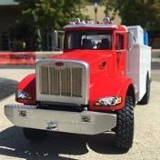
bar side Posted August 21, 2021 Share Posted August 21, 2021 41 minutes ago, silver911 said: Errrrr....what link? This one Link to comment Share on other sites More sharing options...
silver911 Posted August 21, 2021 Share Posted August 21, 2021 25 minutes ago, bar side said: This one It don't work mate 🥺 Link to comment Share on other sites More sharing options...
bar side Posted August 21, 2021 Share Posted August 21, 2021 3 minutes ago, silver911 said: It don't work mate 🥺 Think I am going to save & re host this pesky pic! Link to comment Share on other sites More sharing options...
silver911 Posted August 21, 2021 Share Posted August 21, 2021 Just now, bar side said: Think I am going to save & re host this pesky pic! That would work best 👍 Link to comment Share on other sites More sharing options...
bar side Posted August 21, 2021 Share Posted August 21, 2021 (edited) Try this. Don’t like doing that as it’s not my picture & someone deserves credit but if it won’t link… Edited August 21, 2021 by bar side 2 Link to comment Share on other sites More sharing options...
Stickframe Posted August 23, 2021 Author Share Posted August 23, 2021 @bar side well, after all that work reposting, it sure does look a lot like a certain half-cab! Also makes me think about the dio setting a bit. In Landscape Architecture, there is a term - a haha which is when a change in landform is used to create a perceived/actual vertical gap in the landscape, like a canal, but not obvious from afar - the purpose being to create a barrier for animals, while preserving a long distance views from the other side. I tried to include some images from Flickr - but, it decided it didn't want to cooperate today.....so, I'll eventually post them again! Noticed this message on the bottom of the page: The link could not be embedded because of an unexpected error: error: undefined. I posted them anyway - who knows? Aha!! several hours later, this forum seems to be up and running again! 😀 In any case, in this context, I could build a segment of low lying landform in the foreground of the dio, and add grasses etc, which would allow me to take photos like yours, that suggest the viewer is looking across some rolling terrain to see back toward the actual scene, rather than just looking clearly across a flat landscape, like in the image you successfully posted, where the terrain and ground cover prevents you from seeing where the hull meets the water - might be interesting? Really looking more for an abrupt change in elevation - that isn't too dramatic - so, I suppose, not an official haha, but you get the point! haha! 😀 I saved my text from hours ago, and have since uploaded some progress images! First, a new WASP: Like the half-cab, I opted for sickly green! Seems to look a lot like either some odd-government agency, or the remnant of some equally odd corporate entity - which is why I used it on the truck to begin with. You can see, this WASP has some extra parts for aviation - the keel (rudder?) and flaps underneath - the yellow version didn't get them because - it's being carried on the truck - maybe after a crash?? anyway, the green one gets home in a special place! where the gear can stay intact! OK, on we go with the station - first up, base colors - pretty BRIGHT eh??: Off-beat blue and BRIGHT yellow!! and then, some weather - also, note, this version has my first radar, which I think looks too big.... Then, some weather, and windows: You'll note, some green tint on the glass. This is a bit of an optical illusion - I added some green acetate to the windows on the other side, and clear on this side. This allows the cabin areas to look a bit more interesting without just looking like a really heavy green tint - yes, you can guess how I figured this out, on other projects before - green all around, no light at all - green on one side, some "glow" . You can also see a smaller, and more elaborate radar setup. I haven't weathered it yet, but it will get some dust etc. Oh! yes, added a wind vane (which will get a beacon too) - just dry fit, buy I think in keeping with the spirit of the concept. While not the greatest photo, you can see what's going on - the new radar, wind vane, and landing deck in particular - and about the landing dock: You can see how the slip will work with the WASP, which I am deciding has hovering capability, allowing it to "drop" from the heavens right into place, with a bit of help from the guidance "spatulas" 😀 A footnote, these WASPs are heavy! solid chunks of resin - and I'm please to report, no sagging of the dock! I am really looking forward to taking outdoor photos of this! there are lots of colors that just aren't captured indoors. The trailer and tires/wheels needs more dust - a bit too shiny still. I added a little bench on the deck, where a guy will be sitting - I've begun working on figs - and the poor guy on the bench was beheaded, quartered, and reassembled - and looks ok for the wear and well, being cut up! 😀 And while I was at it, I wondered how the station might look in some sort of (false) context: I didn't spend too much time on these, as well, they don't really matter that much in the bigger scheme of things, but fun to see anyway. The bigger take away from these two has to do with keeping scale, focus, and color tone in the realm of being convincing. For each, there's a backdrop, cutout of the station, and a semi transparent, color filter over the whole image; my feeble attempt to blend them. Not bad - seems adequately McQue-esque so far. Remember, it will still receive outriggers and a big, canvas pavilion! Shocking to say, but work on the base might be starting soon - I need to get thinking seriously about what/how and so on for it. Oh...and there is that spindly tower to make or not - I don't know if there will be room to make it look credible. Maybe it will partially straddle the station? And, I want to add some mid-height background stuff - solar panels? screens? fencing? junked stuff? so that when taking photos, low lying foreground condition in 1:1 scale might be obscured - specifically behind the gooseneck, power plant. and eventually, half-track. Thanks for having a look - Cheers Nick 5 Link to comment Share on other sites More sharing options...
silver911 Posted August 23, 2021 Share Posted August 23, 2021 Great update Nick...always worth the wait...although I am a little confused about the changes in elevation of the groundwork you mentioned. One small detail that still stands out to me...the lack of a ladder to gain access to the radar deck 😉 Paintwork works well in those colours 👍 Would suggest maybe a little scarring to the 'crashed' wasp..... Keep it coming mate Ron 1 Link to comment Share on other sites More sharing options...
Stickframe Posted August 23, 2021 Author Share Posted August 23, 2021 HI Ron, As always, you raise some good questions, so I'll provide some guestimates! First, yes, I can see where my description of the landform might be confusing, so, pictures might help. The images below might be useful: As you can see above, for this I built up some topography along the edge of the dio - something you need to look over to see into the project. Image "A "shows how exaggerated the landform change is - and directly below, a WIP image, with grass being installed. The goal was to get the views "in" to work right - maybe like a vertical forced perspective? This requires the camera angle to be looking over something while viewing in. Something I notice about these (also) is the pictures in the middle and upper left are similar, and taken outdoors, but, there was a light rain when coming through when the upper left was taken. If you look carefully, you can see water drops on my tall grass! The actual scene this is depicting occurred on a very overcast day, so this worked to convey that feeling (maybe like the backdrop for your F1 car?). In the lower left you can see the sort of character I'm thinking about for this project - just enough foreground to to add some interest to the subject. I still haven't gotten to working on the base, but this is what I'm thinking: Above, is a layout concept. The parallel curving lines represent topography, like the previous example - the letter "A" conceptually ties back to the letter "A" on the previous board. The dots with arrows reflect potential viewing locations for pictures. The dashed blue lines represent the area described where I think I'll need some mid-height background screening. The red box with the 'X" the potential footprint of a tower structure. Regarding the ladder, I assumed there was a ladder inside the station - ground floor all the way up. I have a mini-art kit of a scaffold - maybe I'll add it too? I thought about adding a ladder or two to the station exterior, but, remember, there will be the big canvas pavilion - which would make it hard to climb up, so, not sure about this just yet. Finally, one of the few photos of something up close on this project: Believe it or not, there's a lot of heavy scraping on the underside of this WASP - but, now that it's in the truck cradle, it's all but impossible to see anyway! OK, on we go - thanks for having a look Nick 4 Link to comment Share on other sites More sharing options...
silver911 Posted August 23, 2021 Share Posted August 23, 2021 Yep...makes more sense now Nick. However...I was under the impression you were aiming for an arid setting...which would exclude grasses/foliage as such...certainly as regards what your above pics suggest. I guess you could employ rocks or sand dunes to a similar effect...with the odd plant scattered in between said rocks. Looking at your layout...my concern is the loss of the visual plane...or rather...the 'closed door' effect...which relates to objects blocking the viewers main focal point...in this case the station. I quite like the idea of the station being slightly under the raised tower...but...couple that with the above and...personally...it looks as if two thirds of your primary focal point will be hidden. It's...as always...your vision/project...and interested to see what you come up with. Ron Link to comment Share on other sites More sharing options...
Stickframe Posted August 29, 2021 Author Share Posted August 29, 2021 Well guys, Back with another update. @silver911, regarding the setting, I am thinking along the lines of a high desert, which would have some scrubby vegetation and grasses, not a barren sand desert. I don't foresee this as being an oasis, but do see some plant life, with some terrain, along the edges. As for the layout, well, I'm not locked on on anything just yet. Keep in mind the height difference, and odd shapes of the vehicles being built - plus many figures. I think this WASP Hive #5 will have plenty going on, and want it to look a bit cluttered, rather than highly organized. My impression is that we are on the same page in terms of trying to figure out how to pull this together, and I appreciate your thoughts and comments! @Pete in Lincs, I didn't forget your idea of the safety net below the deck. I am annoyed to report that I spent a lot of time building up a frame structure to hang the net from...and well, it works - except, to Ron's point - wow - it takes up too much space for my eye as I built it - simply too distracting. So, that styrene will make its way to the scrap pile and on to some other use. I haven't given up - I found some mesh I like, and some thick-ish wire to suspend it from, but I need to figure out how to suspend it from the/a structure - I just don't have a clear path to that just yet. I may give up, but not right now. Speaking of structures, I built the big tower! Inspired by the McCue artwork, and my early collage work. No paint or primer just yet - as usual, still more styrene to add. That said, I like it so far: Sorry about the poor quality in my cutout - the tower is white styrene - and the background wall is white, so the edges are weak. In real life they are quite crisp, and include some visually interesting details that don't show too well at this point. I need to add one more ladder - if you look carefully, the tower leg on the right has a deck mid level along the leg. On ladder is in place leading to a bigger deck, and now I need to connect it to the ground. In spite of my poor quality photo-manipulation, you can see how this is coming together. I need to tart up the outward facing facades - likely another antenna frame/mast, and various bits of plastic and tubing, bolt heads and so on to get us where we need to be. I can't tell what McCue's tower is actually supposed to have been or be - but I like it. For this, I decided it was some sort of a one time grain elevator. You'll see a thick white box connecting to the ground, just inside of the right rear leg - and you can barely see a couple of chutes, made from brass sheet underneath the first floor. What's also hard to see is I used some grooved styrene on the lower floor, and plain siding on the upper floor - suggesting the lower floor may have been a mechanical room, while the upper floor, for people - that's my story and I'm sticking to it! Just for grins, I might take a vehicle or two outside tomorrow and take some bright sunlight photos to see if these colors are "popping" the way I want them to. OK gents, happy model building - Cheers Nick 5 Link to comment Share on other sites More sharing options...
Stickframe Posted August 30, 2021 Author Share Posted August 30, 2021 Hi model builders, One more update! I've taken some pictures of the tower - pre and with primer: You can see - I added some details, and as is the case, the primer helps show some of them. Plenty going on (the roof was very tedious to make - it's supposed to be standing seam sheet metal - the standing seams are evenly pieces of .01 x ,03 pieces of styrene glued in place.....!) - including trying to settle on a color. The faded, rust red on the original images is nice, but I think it might look too "heavy" in the context of a diorama - could look like a really big red box hovering over our project. I'd go back to my trusty light blue or yellow, except, the "station" uses those colors - maybe a light grey? with rust red accents? The next image shows how McQue handles it - but, he can tone the red down by adding the dirty pinkish, dusty sky - I won't have that luxury - just regular blue sky. BTW, I like the pics in the left side of the image above - and the spindly spine (stairs and tower) going from the ground into the sky - A few more character images for the tower - color and details, and the prototype towers! I'm still experimenting with photos for the layout, to try and figure out how to make a backdrop - mostly to screen out views I don't want to see: This still isn't a real layout - instead basic organization - and most revealing, the two red lines - which represent about 6' and 12' (2m and 4m +/-) height above ground level. I don't want to build a big building here, so will instead rely on fences, debris, maybe abandoned cars/trucks? and so on to help obscure whatever might be in the background when taking photos - like in this case, the light switch on the left, and door frame on the right! I hate seeing that stuff - very distracting! and often a real challenge when taking outdoor photos. I've kept experimenting with photos to see what might happen: As this is only for illustrative purposes, I'm not too concerned about the wacky color contrasts - instead, you can see a few new visual features. First, there is a "new" sky, and separate image for the ground plane. I think this is a more reasonable representation of where this is going than the previous landscape backdrop. You'll also see the basic idea for some foreground topography and vegetation - not just the edge of the base. As mentioned above, not too tall - maybe an inch or two above the base, just enough vertical change to serve as a visual transition. Also - some ultra hip looking solar panels on the left! These are from an artist rendering - and I've liked the basic look and shape since I found the image, at the early stages of this project. They look fun to try and make!! maybe old CD material for the finish?? who knows - but, pretty cool (you can see part of them in the character images above). Also, a long corrugated metal fence along the back - a bit too pronounced for my taste (colors) and way too monotonous - something(s) will go there. I think this illustrates the basic intent. OK gents, on to the work week we go - cheers Nick 6 Link to comment Share on other sites More sharing options...
silver911 Posted August 30, 2021 Share Posted August 30, 2021 Love the 'tower'...works well as a compliment to the vehicles. Colour wise...for me at least...the trick here is to create harmony...and...as is my favourite...a 'balance'. In this respect...I would disagree with your saying the reddish hue would look like a big red box...when actually...it would blend better with your proposed 'high desert' setting...with the 'balance' achieved between the ground colour and tower. This would act as a 'frame' to the picture. I agree with avoiding the blue and yellow tones...but grey is not the answer IMHO Within the earth tones range...such as the rusty red of McQue...there are many options available to you...any and all would benefit from being very washed out...thus avoiding the big red box effect against a blue sky. For instance...you could look for an early sunset...or even a dawn setting when photographing the scene...now there's a challenge for you mate. Composition wise...the colours will...to a degree...lend themselves to the choice of layout...in as much as they will stand out if they clash when side by side. Remember what I said about a dark colour making a lighter colour seem lighter still. All in all...some real challenges to be met Nick...and great fun to see how you deal with the coming hurdles. Ron 1 1 Link to comment Share on other sites More sharing options...
Stickframe Posted August 30, 2021 Author Share Posted August 30, 2021 Hi Ron, thank you for the advice on this! I really appreciate it 😀 I’ve been slowly painting away and your guidance is directing me to a repaint of part of this - what that means is the grey paint I used looks bad, exactly as you mentioned above - perfect. I painted the legs and lower level w faded rust orange - but used a blue grey for the upper level - and, just as you suggested, it looks wrong! So - back to mixing colors for a darker shade of rust red/Tuscan on the top level. I’ll leave a few surfaces grey for contrast but not much. Cheers Nick 1 Link to comment Share on other sites More sharing options...
silver911 Posted August 30, 2021 Share Posted August 30, 2021 1 hour ago, Stickframe said: Hi Ron, thank you for the advice on this! I really appreciate it 😀 I’ve been slowly painting away and your guidance is directing me to a repaint of part of this - what that means is the grey paint I used looks bad, exactly as you mentioned above - perfect. I painted the legs and lower level w faded rust orange - but used a blue grey for the upper level - and, just as you suggested, it looks wrong! So - back to mixing colors for a darker shade of rust red/Tuscan on the top level. I’ll leave a few surfaces grey for contrast but not much. Cheers Nick Those areas you are thinking of using/leaving grey...with your penchant for a rusty hue...try your wasp yellow (faded)...I think you will enjoy the blend of the rust and faded yellow more than any grey 😉 1 Link to comment Share on other sites More sharing options...
Pete in Lincs Posted August 31, 2021 Share Posted August 31, 2021 And I was thinking faded rusty pink for the roof areas. Ah well, what do i know? I really like the tower, may I suggest a chimney? There is one in the McQue pictures. There's also a windmill on the LH side. That might help to hide a bit of background. The solar panels look great too. How about a string of lights around the tower? There are also what look like lifebelts on one of the towers. What's that all about, I wonder. Figures, on one of the balconies, a figure cradling a rifle perhaps? It hints at a threat and may add a little tension to the scene. Of course, he would need a telescope to see the baddies. Have a good week. Pete 1 Link to comment Share on other sites More sharing options...
silver911 Posted August 31, 2021 Share Posted August 31, 2021 Rusty Pink would work Pete. Chimney is a cool idea. Windmill was a good spot. Agreed on those solar panels...would help to balance the scene if placed on opposite side of scene to the tower. Lifebelts would work on tower and station...reinforces the 'nautical' air of the station architecture. Also...a lot of loose hanging cables on the tower...as per McQue pic. A 'sniper' would work well...https://www.elgrecominiatures.co.uk/collections/np-trigger-line-1-35/products/overwatcher-1-35 That lot should keep ya busy Nick 😇 1 Link to comment Share on other sites More sharing options...
Uncle Monty Posted September 2, 2021 Share Posted September 2, 2021 I'm new to this thread and i'm still working through the pages. I just wanted to say this is a wonderful piece of work. Not just technically good but also a great piece of storytelling. Thanks for sharing it with us. 1 Link to comment Share on other sites More sharing options...
Stickframe Posted September 5, 2021 Author Share Posted September 5, 2021 Well guys, I have my work cut out for me! @Uncle Monty, thanks! glad you're enjoying this build! It's been fun. @silver911 and @Pete in Lincs, well (again) you two are evil!! lol 😁 Lots of good ideas in there - I'll need to write up a list to keep track of them all! In the meantime, we had a nice and sunny day! So, you know that meant, outside with a few pieces of this build! The upside to this is we'll finally get to see some real color and no more of my low tech shenanigans with poorly made backdrops etc!! But, other problems emerge. I love outdoor images of the build, and I think I've been clear on my disdain for unintentional background!! So, off we go - first attempt of images at my neighborhood park, which is essentially across the street, requiring, according to the Iphone, a round trip walk of approximately .17 miles: and wow! we have some strong color! uhhh, we also have some verdant landscape....as you can see in the lower right, the nhood pocket park, which has nice big concrete bench in the center - nice....unless, you don't want to see copious amounts of nicely maintained urban landscape!! So, after I took these and several other pictures, and wasted about an hour attempting to digitally remove the trees from the images, I concluded the right thing to do was carry these two back outside, and walk them the 1.4 mile roundtrip to the better location for pictures - so, I did just that. And what happened? The Attack of the 50' Woman in real time! ARRGGHH!! 😁😁 oh, and her little white truck too! 😁 She was marching toward me, and then made an abrupt turn out of the image - that was nice of her! It's too bad about that fence with the black screen, but I think it's better than the shrubbery! Fun and games done, let's get back to our serious discussion - I think the colors worked out just fine! As two keen observers (you know who you are!) will see, I went with variations of rust and yellow for the tower, and it was the right approach - thanks guys for sharing your thoughts on this! And not to be resting on my laurels, I built some more vehicles - as the pictures are comparatively dull, they'll be dropped in between the color splash images: I know - this truck is somewhat ubiquitous, but it seems to fit the part. It received my obligatory lift-kit, so it sits higher than OOB - just added some styrene between the leaf springs and frame. And, I cut about 1/3 of the height of the bed sides off - I prefer it looking a bit more like a flatbed. Back to color: A few more close ups. Check out the nice and shiny brass bell on the flight deck! These are both broadly done, and reflect the right amount of the McQue-vibe....and, yes, I'll likely add the smokestack to the tower - and a few more odds and ends to go - including eventually stringing a canopy off the station (remember the outriggers). As I futzed around with this last week, the looming headache of the backdrop never faded, so in addition to what I mentioned before, I concluded a tired out truck and car would help: The new cars (including the small truck) are straight out of the stash...Items I've had sitting around so long it was clear, they were not waiting for anything more special than this. I can say, they were each good builds - no problems at all, and they look better in real life than shown in these unfortunately dark pics. I left the right front tire off this to get that sad, sagging look - it has seen happier days. And, the last images: It's funny, these were taken at my more "ideal" location - lol. The pic in the left is in front of a very colorful building, which at one point belonged to the university, and is now very fancy office space - but, it also features that super graphic, which despite everything I've just said, I like in the context of this photo! the other, well, I just like it. OK, on we go - have a good one Cheers Nick 5 Link to comment Share on other sites More sharing options...
silver911 Posted September 6, 2021 Share Posted September 6, 2021 First off...a class update Nick...absolutely stunning craftsmanship in every respect. I am glad you went with a nice reserved blend of colours on the tower...works perfectly IMHO One thing I must say...your weathering is sublime...very natural and...above all else...totally believable/realistic. With your build/scratch skills...you have the complete arsenal in your tool box...bravo mate As an aside...I get your passion for outdoor photo's...natural light gives natural shadows etc. ...however...where backdrops are concerned...let me offer you another avenue to explore. For a recent figure piece...I made use of my PC monitor...although...for a piece as large as yours...a TV may prove better. Here is a link to some pics...to give you a proper idea of what I am talking about...(scroll down to the second set of pics)....... https://www.planetfigure.com/threads/tribute-finale.357719/ Now...the main advantage is in fooling the viewer into seeing what you want them to see...with no need to resort to photo editing software and the like. You can control the intensity of the backdrop (screen pic) by playing around with contrast/brightness/saturation etc. ...change the resolution...even the sharpness...all from a remote control. Another beauty is...because the screen is lit from behind...it will not show any shadows thrown by the model...unlike a flat paper/card picture that is stood behind your model. There are many other tricks you can employ using this method...which I am sure you can work out for yourself. Looking forward to the next thrilling installment mate Ron 2 Link to comment Share on other sites More sharing options...
Pete in Lincs Posted September 6, 2021 Share Posted September 6, 2021 Fabulous update. Colours, shading, rust. It's all come together to become a realistically convincing construction. The Landcruiser pick up looks great too. I like the cut down sides. I used to drive one in Saudi, they're an impressive bit of kit, and should last forever. I like Ron's idea of the flat screen backdrop too. Sounds interesting. Looking forward to more. 1 1 Link to comment Share on other sites More sharing options...
Badder Posted September 8, 2021 Share Posted September 8, 2021 (edited) It's artificial.......................... but it looks so real. Mad as a box of replicant frogs. If you had been around in the 60's Sylvia and Gerry Anderson would have snapped you up. Rearguards, Badder Edited September 8, 2021 by Badder 2 1 Link to comment Share on other sites More sharing options...
Uncle Monty Posted September 12, 2021 Share Posted September 12, 2021 Superb photos, very Mad Max. They have that post-apocalypse rusty slightly insane look to them 😀 2 Link to comment Share on other sites More sharing options...
Stickframe Posted September 13, 2021 Author Share Posted September 13, 2021 Ahh - feedback from other dio builders - nice! @silver911, wow Ron - that's a great idea - nice! And bigger WOW! what a build - beautiful. As for this....scale - it's a big base - I'd need some sort of wall projection device to shoot this! And thanks for noticing the weathering. Maybe a bit like your unbelievable motor paints, this process includes several layers of colors and is mighty slow going - and, on a big project like this, it's necessary to redo the same steps on everything - results, yes, tedious, but mighty slow going..... But, I do it every time - sometimes when I'm feeling, well, who knows, I even add it to the backsides that will never be seen....it's an illness....😄 @Pete in Lincs thank you sir! for all of the above - and glad you like the land cruiser - great trucks that seem to last for ever! Seemed ideal for a little runabout here! Now, @Badder, need I remind you? Model builders have feelings too! 😪 hahhaa! No we don't! we build stuff! At the beginning of this blog I, well, added a caveat to those getting on board - this project is an odd one! It isn't competing to create actual realism, but it is after convincing realism! 😁 That's my story and I'm sticking with it! now, I'll need to avoid the frogs! 😁 @Uncle Monty, thanks and glad you like where we're heading - As we go, you'll see, this will not lean too heavily into the Mad Max realm, beyond weathering and decrepitude - seems McQue's work isn't particularly representative of the "end of days" or overtly violent. Having now looked at lots of his work, it seems to have a very casual vibe, despite the obviously unusual quality it has - this must sound like an odd recitation if you've just stumbled into this build - the subject of "tone" has been discussed a few times - mostly by me skirting around making decisions, or, more appropriately, me sharing my challenges with making decisions that embrace the McQue character - I found this to be easier said than done! It's why the colors are all in the family of washed reds, blues, and yellows - almost comic book representations of institutional/governmental/corporate stuff, but evidently nearly abandoned, or cobbled together - offset by metal and wear - ok - I'll stop now - my thinking about this tends to get very uptight! I feel better tho! 😁 OK, a guy has now spent more time than you'd imagine thinking about and building a backdrop. Ideally, there would be no backdrop, and the viewer would simply see scrubby high desert in the background - but as we've discussed several times - that would be hard to make happen without lots of cheating! (ie heavy digital manipulation!) So, instead, I built a string of screens at varying height and with different materials, to make, this: well - that looks easy enough - lol - maybe to others! Not me tho - this took some time. I won't bore you with it, but there is a little story/rationale for each segment - affecting color choice, height and materials....perfect. And of course, I have cut heights, changed materials and colors - several times....and, what's hard to tell in this photo, the two yellow panels in the middle, are not parallel to the back of the base like the other segments. They are instead oriented to the tower, which sits at angle to the boundary....ok - I'm boring myself at this point - let's see another pic: I'm confident the logic of it all is now completely evident to you viewing this....uhhh, or maybe not? 😁 I don't know. I promise to not go on and on - the buildings are taller on the right side of the dio, and the tower has a big ground level opening - whereas, they're shorter and less visually dense on the left. So, stuff on the right closes the space in - horizontally and vertically - and on the left, are lighter in color, but bright - and will just "get lost" behind the station and halftrack, they'll provide some variety, but not be distracting - or that's what I'm hoping will happen. Back to my mediocre graphics. I mentioned a while back that yes, I took photos of the sky - and here is one of them behind a cutout of the WIP: Hopefully the preamble makes more sense now - aside from dark shapes on the right, and a punch of color on the left, the bkgd fades away...and a few others: And there you have it as of tonight. I think we're heading in the right direction - seems I could be getting closer to preparing the ground??? or...the dreaded task of figures!! I'm planning to use a few that I used in dio a couple years ago - it was purged! But before, I picked off the figures and a vehicle or two - and, some new figures -new, in terms of not painted - straight out of the stash- except, for one sentry sniper, that I believe Ron will recognize!! 😁 I better not screw up the painting on her! oh - and crap, I think I'll need to do more than primer on the underside of the tower!! I looks pristine as is, and obviously (now) it will be evident in photos....the list of to-dos isn't getting much short..... OK gents, a guy needs to get dinner! Cheers Nick 3 Link to comment Share on other sites More sharing options...

Recommended Posts
Create an account or sign in to comment
You need to be a member in order to leave a comment
Create an account
Sign up for a new account in our community. It's easy!
Register a new accountSign in
Already have an account? Sign in here.
Sign In Now