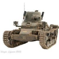
diablo rsv Posted February 16, 2021 Share Posted February 16, 2021 I am currently building Bronco's Valentine Mk.IX and I'm trying to depict Buccaneer as depicted on the box art and seen in this photo. You can see a WIP Here However I cant find any photos of the left hand side for this or any similarly painted vehicles apart from this one. However the patterning on this vehicle is at odds with the official 'Scheme for Disruptive Patterning' and the profile in Dick Taylor's book Into The Valley. Both of these have the green disruptive colour, where it goes up from the side skirt, further forwards clipping the exhaust shield and in the case of the profile covering part of the auxiliary fuel tank. I have gone with the image above as it is the only one available to me but obviously the fuel tank is missing from the vehicle in the photo so I don't know whether it should be painted or not or whether the green should be further forwards and miss the fuel tank. I know I'm probably over thinking it but I would hate to finish the model only to discover that I had taken the wrong path. Any help would be appreciated. Wayne 1 Link to comment Share on other sites More sharing options...
APA Posted February 17, 2021 Share Posted February 17, 2021 Can't help with your question however I have noticed the barrel appears to be painted dark top and bottom? Maybe to simulate a thinner, therefore a smaller gun? Was that a thing or is it a trick of the light? Sorry for the additional serving of tinned worms 😂 A Link to comment Share on other sites More sharing options...
diablo rsv Posted February 17, 2021 Author Share Posted February 17, 2021 1 hour ago, APA said: I have noticed the barrel appears to be painted dark top and bottom? Maybe to simulate a thinner, therefore a smaller gun? It is on the tank in the bottom photo but not on the photo of the tank I am modellling. There were some slight interpretations of the scheme. I would imagine the barrel on this one was painted that way to counteract the shadows. 1 Link to comment Share on other sites More sharing options...
Mike Starmer Posted February 19, 2021 Share Posted February 19, 2021 Buccaneer is finished in the October 1942 pattern for Valentines. The lower picture is a tank which had that pattern in green over sand but been retouched with black in some places and had an extra section added to the turret. Normally the fuel tank would not be disruptively painted since these were only attached to whichever vehicle needed them during transit. The pattern is an overall scheme, not just on the sides. PM me at mikestarme18 at gmail dot com and I will send you a copy of the official pattern which Valentines carried as applied at workshops. These were not random ad hoc crew applied schemes. Make subject Valentine colours otherwise it will get spammed. Link to comment Share on other sites More sharing options...
diablo rsv Posted February 20, 2021 Author Share Posted February 20, 2021 14 hours ago, Mike Starmer said: Buccaneer is finished in the October 1942 pattern for Valentines. Thanks for replying Mike I have now repainted following the official Valentine pattern, dated 17 Oct 42, from your Alamein & After booklet. I got a little side tracked by the bottom photo, I hadn't thought about retouching. Wayne Link to comment Share on other sites More sharing options...
nheather Posted February 20, 2021 Share Posted February 20, 2021 Is this the one that Bovington run at Tankfest - if so that has camouflage that misses the fuel tank. Of course that is a modern paint job so it may not be 100% accurate. https://imgur.com/gallery/oNIRl Cheers, Nigel Link to comment Share on other sites More sharing options...
diablo rsv Posted February 20, 2021 Author Share Posted February 20, 2021 1 hour ago, nheather said: Is this the one that Bovington run at Tankfest - if so that has camouflage that misses the fuel tank. Thanks Nigel. Yes, the model and Bovington's are based on the same vehicle. You would think that with all of the resources available to Bovington that it would be an accurate portrayal of the vehicle but I'm always a little sceptical of modern restorations, especially after their Matilda with the blue in the Caunter scheme. I'm not sure when this restoration was done but they have gone with Light Stone as a base colour rather than the Pink. From what I can tell by the time this tank reached the base workshops Desert Pink would have been the more likely colour. Maybe Mike would know why they chose the Light Stone base. Their disruptive pattern does roughly match the October 1942 pattern for Valentines that Mike mentions above. Wayne Link to comment Share on other sites More sharing options...
nheather Posted February 20, 2021 Share Posted February 20, 2021 13 hours ago, diablo rsv said: Thanks Nigel. Yes, the model and Bovington's are based on the same vehicle. You would think that with all of the resources available to Bovington that it would be an accurate portrayal of the vehicle but I'm always a little sceptical of modern restorations, especially after their Matilda with the blue in the Caunter scheme. I'm not sure when this restoration was done but they have gone with Light Stone as a base colour rather than the Pink. From what I can tell by the time this tank reached the base workshops Desert Pink would have been the more likely colour. Maybe Mike would know why they chose the Light Stone base. Their disruptive pattern does roughly match the October 1942 pattern for Valentines that Mike mentions above. Wayne I know what you are saying which is why I added the caveat. I visit Bovington fairly regularly. On one occasion I was trying to see what SCC2 actually looked like as I had just bought the Tamiya Centaur. I saw a few possibilities but nothing convincing so I tracked down one of the curators and had a good conversation. He was very honest and advised me not to trust museum exhibits for authenticity because unfortunately many were painted in the 1970s and the 1980s, often by cadets, who were given access to the paint store to use whatever was available. He said the only way to know for sure would be to remove things like tool boxes to see if the original colour remains underneath. However, he did say that thankfully, since the late 1990s museums have taken much more care with authenticity. I visited Bovington last September and was interested to see that a number of exhibits had been repainted including the famous yellow and blue Matilda and the pink Panther. This is what their Matilda looks like now. Cheers, Nigel 2 Link to comment Share on other sites More sharing options...
Bullbasket Posted February 21, 2021 Share Posted February 21, 2021 A couple of classic examples of why you should be very wary of museum paint schemes. This is Saumur's Centaur and Comet. I'd love to know what reference they were using when they painted these two! John. 1 Link to comment Share on other sites More sharing options...
diablo rsv Posted February 21, 2021 Author Share Posted February 21, 2021 12 minutes ago, Bullbasket said: A couple of classic examples of why you should be very wary of museum paint schemes. It amazes me really. When you think about the lengths that we as modellers go to to get the most accurate model that we can and hardly anyone will see. Yet a museum with all of their resources can get a restoration, that proberly thousands will see, soo wrong. Wayne 1 Link to comment Share on other sites More sharing options...
Mike Starmer Posted March 6, 2021 Share Posted March 6, 2021 Oh dear. Whilst the Bovington Matilda looks better than it did in blue, they still haven't got the pattern correct, The Silver Grey should not extend up the sides of the turret, I shudder to think what the rest looks like. Their library has a book I sent years ago with the correct pattern, complete with colour chips. They have used modern Light Stone, not the wartime colour, otherwise the the other two look about right. Desert Pink did not exist in 1940-41 when Matildas were painted in this scheme. As for foreign exhibits, these are often painted according to subjective colour decriptions and half recalled memories. I only takes an old soldier to look at the Comet and say 'we had those in the desert in sand and green', and hey presto! he was there, he must be right. This is the sort of comment I have heard many times whilst interviewing ex servicemen. 3 Link to comment Share on other sites More sharing options...

Recommended Posts
Create an account or sign in to comment
You need to be a member in order to leave a comment
Create an account
Sign up for a new account in our community. It's easy!
Register a new accountSign in
Already have an account? Sign in here.
Sign In Now