

Andy Moore
-
Posts
2,724 -
Joined
-
Last visited
-
Days Won
1
Content Type
Events
Profiles
Forums
Media Demo
Everything posted by Andy Moore
-
Work's still progressing on the quad, albeit at a snails pace. I'm still waiting to hear about the decals, so I can't really do much more painting or weathering on the main body parts for now. I have beent painting some of the smaller details though including the mid band and the bumper panels. I was originally going to paint the small side shields separately, but in the end I decided it would be quicker to glue them in place on the mid band and paint everything together. It did make getting paint behind the shields a little harder but otherwise it worked out better this way. The front and rear bumper panels were still painted separately, then glued into place after I'd done the weathering. Paint was satin black lightened with a drop of sand brown, after which the weathering was done with a light grey using a combination of brush painted chips and scratches and some rough dry brushing. I used the same weathering method on the black areas of the upper and lower body, and I've masked and sprayed the red border around the recessed panel on the rear body. I can't really take these parts any further now until I get the decals sorted. So this is how he's currently looking with the feet in place. Still some more detail parts to add, and plenty more weathering to do. Andy
-
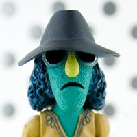
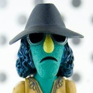
Thanks chaps The base coats were airbrushed, then brush painting for the glazes. I think I used a size 1 round for that. I normally use smallish round brushes for most work. I'll use flats for dry brushing. I've done most of the work on the head now. That started with a base green mixed from Tamiya and Gunze colours. I used a lightened shade of the same colour to add some highlighting to the top of the head and ears, then mixed some Tamiya flesh into the last bit of paint to get some colour into the ears. There's a tiny bit of that colour around the eyes and forehead too. That base colour would be pretty good if this was Yoda, but Grogu seems to have a cooler green tone to his skin, as well as some pinkish tinting around his eyes, mouth, and cheeks. I switched to Vallejo, and added a overall glaze of green sky. I then added some further highlighting to the high points on the face and forehead with Vallejo verdigris glaze. The pink tinting was added to the face, along with more colour in the ears. The eyes were also painted in with dark brown for the iris and black for the pupil with a little bit of golden brown highlighting around the edges of the pupil. At this point the face was looking a bit clownish and crude, and I was wondering whether to start from scratch again. In the end I decided to stick with it and see if some glazes of the base colour would tie everything together better. The body has also had some additional work, starting with some oil washes to increase the contrast and define some of the details better. I also used the same wash to speckle some dirt and stains on the fabric.. The fleece collar had more shading added, followed by a dry brush to bring out the texture better. The head has now had the glaze added using Vallejo green sky again, and it looks a little better than before. I'm still not entirely happy with the pink tinting around the face, mainly because I didn't blend the colour in very well so it look a bit like he's wearing makeup. I might have to glaze those areas over a few more times to tone it down. I'm unsure yet whether to try and paint the short strands of hair on his head, or leave it like this. I'll probably see how it looks on a test piece first. I'm also in the process of making a small base for him to stand on, and I've found a little ball bearing to use for his control knob toy. Andy
-
Starship Maintenance trench wall hanging
Andy Moore replied to Pete in Lincs's topic in Ready for Inspection - SF & RealSpace
Really clever build Pete, and a great way of displaying the Vaurbian freighter. Andy -
1/12 Mandalorian 3D Print
Andy Moore replied to Hunter Rose's topic in Ready for Inspection - SF & RealSpace
He looks fantastic Hunter. I love how your weathering has made the mish mash of colours on the early season armour really gel together. Andy -
They're a Russian company called Tank. As far as I know their figures and heads are pretty good. I'm not sure if they're still in business, they used to have a website, but is doesn't seem to be active anymore. You can see their other products on Scalemates. Andy
-
You've done a great job with it. I hope you can find a distributor and get the model to market. Andy
-
There seems to be something of a Mando figurefest happening on BM at the moment with @Hunter Rose's excellent looking Mando figure, and @rockpopandchips's equally cool Mando and Child already in progress. I thought I'd join in the fun with a figure I've recently printed of Grogu. The original file is from CG Trader, and is a very nice sculp, and conveniently scaled too as the default size for the print is 100mm to the top of the head meaning it can be easily scaled down to whatever size you need. I printed this one at 50%, so it's about 50mm high making it roughly 1/7 scale. I'll probably print another to 1/12, which would need to be around 28mm. It's a four part print consisting of the body and arms, the head, and the left and right hands. At this size I could fit everything onto the build plate which cut down on print time. I printed it with a 0.05mm layer hight for speed, so the print lines are a little more prominent than they would be If I'd used my normal 0.025 layer hight, but it still looks pretty good. Dry fitted, the sculpt does a good job of capturing the look of Grogu in the show. There's some nice texture on the fleece collar and cuffs, and good definition on the face. I spent some time cleaning up the marks left form the print supports from the neck and underside of the head, only to realise that they'd be completely hidden by the collar anyway. I've made an initial start on painting the body after priming the parts with Mr Surfacer 1000. The cloth parts had a base coat of Khaki, followed by some highlighting along the folds on the cloth with Deck Tan. The shadows were then deepened with a darker shade mixed from Khaki and NATO Brown. The collar and cuffs are straight Deck Tan. I then went over the base coats with some acrylic glazes to give more definition and darken the shadows further. You can see how some of the glazes have seeped into the print lines around the front flap of the tunic, but that doesn't bother me too much as it just looks like the weave texture of the fabric. Next job will be to lay down a base coat for the skin, once I've found a suitable green tone. Andy
-
Opel Maultier and Neger midget submarine
Andy Moore replied to Carius's topic in Ready for Inspection - Armour
Fantastic build Cesar, as always. Is the trailer based on a real design, or just a plausible solution to transporting the sub? It looks great in either case. Andy -
Yes, it definately helps to have something to work from, especially when the thing you're making is completely made up. Apologies fro the slow rate of updates on this. I've done a little more work, which I'll post below, but I'm really waiting to see if I can get the decals printed. I've contacted someone about it, but still waiting to hear back. If anyone knows someone who can print decals I'd love to hear. So, as I said, I've got a little more work done. The black parts of the body have been sprayed, after masking off the yellow sections. There are various shades of dark grey/black used here to give a faded/weathered look. I just randomly mixed drops of blue, red, sand and green into the black paint to get different tones across the surface. They're pretty subtle and don't show up that well in the photos, but they look better in person. With the masking removed, some of the edges will need tidying up a little, but otherwise it turned out okay. The black sections will get some further weathering, as per the illustration, but then the body sections will be essentially done until I can get the decals printed. In the mean time I'll make a start on painting the various greebles. I've already got the main base coats on the feet and legs, and weathering them will be the next job. Andy
-
Mandalorian in durasteel and the child
Andy Moore replied to rockpopandchips's topic in Figure Work In Progress
That looks like a great print Brian. Love the billowing cape. I pre-ordered one from here Mike. Cheapest I've seen it in the UK, and free delivery too. Unfortunately, it looks like they've filled their pre-order slots for the standard one, but they've still got the plated version available, along with the figures -
1/12 Mandalorian 3D Print
Andy Moore replied to Hunter Rose's topic in Work In Progress - SF & RealSpace
He's looking great Hunter. The metallics look really nice, and set off the painted armour really well. You can, at least for the season 1 concept art. Andy -
Dark Souls Boss Fight.
Andy Moore replied to Red Five's topic in Ready for Inspection - SF & RealSpace
Fantastic dio Simon. I've never played Dark Souls and, based on this, I don't think I will be anytime soon. Out of curiosity, is there anything lurking in the shadows behind those legs? (this is possibly a question I don't want to know the answer to) Andy -
Thanks for the input everyone. I agree, the white wasn't really working, but at the same time I felt the plain yellow was a little too bland. In the end I've settled for having a white band around the bottom edge of the upper body. I think it gives the design a bit more pop without being too obtrusive. Thanks Dan, Yes, I agree, having the mid section in yellow would highlight the vents better, but I really like the contrast between the black and yellow. My plan is to have the yellow fairly glossy, like painted metal, then have the black sections in matt to look more like the kind of moulded trim pieces you see on plant machinery. So, this is the final design (so long as I can get the decals printed) Getting that sorted has meant that I've been able to make a start on painting. I wanted to do the chipping on the yellow parts with masking fluid, so the first job was to lay down a coat of dark rusty brown. After that was dry I applied the masking fluid, mainly with the tip of a toothpick to keep the chips as small as possible, then sprayed a white basecoat in preparation for the yellow. I masked off the white band on the bottom of the upper body, then sprayed the first coat of yellow. This was a fairly pale lemon yellow to which I added another layer of masking fluid, so the pale yellow will show through in places under the final yellow coat. The final coat was more of a golden yellow, and once that was dry I removed the masking. The result of the chipping isn't too bad, but I'll probably go back and refine them with some brush painted chips later on. The paler yellow doesn't show up that well until you get close up, but it does add a bit of subtle variation to the finish. A lot of it may well get lost under the subsequent weathering though. Next job will be to mask off the yellow parts ready for painting the black sections. Andy
-
Yes, it's basically a primer that comes in different grades. I'm using 1000 which is kind of like a micro filler and primer. I'm airbrushing it and it leaves a nice even surface, but it's quite matt and it benefits from giving it a quick rub with a fine sanding pad, or even an old t shirt or something, just to smooth out the surface, especially if you're going with a glossy top coat. So, firsty, appologies that I keep posting artwork instead of model shots, but I want to nail down the colours before I start painting so I'm not having to wing it later on. Having said that, I'm now going to post some more artwork🙄 I'm definately going with the yellow and black mining guild scheme, but the sketch I'd done previously was based on a an earlier photo when I didn't have all the final bits and pieces printed. I really needed to redo it with everything in place, so I know exactly what colour everything's going to be, which I've now done. The one thing I'm still unsure about is the white section under the mining guild emblem. @Will Vale mentioned that it would look better with an even border of yellow around it, which I agree with, but I'm still not sure if it looks better with or without the white panel. I've drawn up both versions, so I'd love to hear which people prefer, or it anyone's got any other suggestions. I had to temporarily stick all the bits onto the model to take the photo I used for the sketch so I'll post those too, so at least this update actually has some model shots in it, and you can see how it'll look in it's final form. The main body has had the primer coat now, so it's essentially ready for paint. I've also attached the mesh grilles behind the openings on the front and sides, and added some guitar string cables to the feet. All the small details are in place here, but I'll be removing them to paint separately. Andy
-
1/6 Battle Droid with STAP
Andy Moore replied to Hunter Rose's topic in Work In Progress - SF & RealSpace
I like the jury-rigged clamp support, and it looks like it's worked really well. I think you've nailed the pose; definately looks like he's counterbalancing the lean on the bike. I wouldn't mind one too, especially after watching Hunter's build. I'm wondering if Round 2 will reissue this kit now they've got the SW licence. Probably still be expensive even if they do. Their kits aren't exactly cheap at the best of times. Andy -
I really love the colour palette you've used here. I'll have to try your recipe for the bronze armour as it looks very effective. Andy
-
Thanks all It doesn't really seem that small in person, probably due to the relative chunkiness of the figure. It's about 60mm to the top of the head. Andy
-
In light of Dennis's suggestion of a mining guild droid, I've reworked the yellow version slightly and added the guild logo (and a lot more weathering), and this is the one I'll be going with. Just need to get some decals printed for the logo and text. I also did one in a dark grungy finish that will get used on either another quad gonk or some other future droid. I've just finished priming the main components with Mr Surfacer. I'll give that a couple of days to fully harden before rubbing it back and giving it a quick polish, then I should be ready to start getting some paint on it. Andy
-
Thanks chaps They're actually based in Russia, but yes, you need to order direct from the company. It's possible that a store like El Greco might import these at some point. It might be worth contacting them to see if they've got any plans to carry these figures. Andy
-
Ah, thanks so much Dennis, that's perfect. I'd forgotten about the mining guild colours being black and yellow. He's now got an identity; an over-worked mining guild droid, slowly starting to rust away. I'll just need to draw up the guild logo and find someone to print out some decals. As for the other colours, that's the beauty of 3D printing; I can make as many of these as I want now, so I'm sure I'll end up doing the other schemes eventually. With the Mars 3 coming out in the near future, I'm sure there's going to be a lot of Mars 1 and Mars 1 pros (the one I've got) going cheap when people upgrade. It still amazes me what a relatively cheap resin printer can do, and once you've got one you have an almost limitless supply of parts. Andy
-
This is a cat knight figure from a company called Blood Carrot Knights. It's a really impressive sculpt, packed with detail, and was a huge amount of fun to paint. This one's painted in honour of my old cat Alice, who we lost back in 2019. And the inspiration The company have got a few other cat knight figures, including the newly announced General Catobi, which I will absolutely be getting. Andy
- 16 replies
-
- 40
-

-

-
Anyone for greebles? These all printed far more cleanly than I was expecting really, given the small size. For reference, the little round plug thingies in a row of eight on the sprue strips are each 1mm in diameter. The larger ones in a row a six are 1.8mm. Printer resin is rubbish for showing detail until it's painted, so the CAD image of the designs below shows them better. Some of these will end up on the Gonk, in particular the centre plug on the strip of six, the square one with the rounded corners and the hole in the middle. That one's going to be the plug on the trailing cable for Pete's tail idea. Andy
-
They look lovely Will. The dry brush looks like it's added some very nice micro-texture to the skin. Nice bit of verdigris on the weapons too. The vibrant bases look fantastic. Is there a colour transition under the gloss coat, or is the effect coming from reflections? Andy
- 6 replies
-
- 1
-
-
- Games Workshop
- Age of Sigmar
- (and 1 more)
-
Excellent result! There would have been a filler cap in the hole, so this looks perfectly acceptable to me. Regarding the drive sprockets, I've built a couple of these in the past, and on both builds the tracks were very troublesome to wrap around the sprockets as the teeth are a bit oversized to slip into the channels in the back of the track links. On both builds I just snipped the teeth off where they protrude beyond the edges of the track frames. The track runs can then just run around the perimeter of the frames, and are far easier to fit, epecially if you've painted them before fitting. Andy
-
It's more of a faded black, but I might try it with grey as well. I like the idea of the tail. Like one of those auto retract power cords on a vacuum that always break. I realised I'd forgotten to show the back of the upper body before. I've modelled it with an inset section where the main connections or controls will be. The back of that inset area then has a slightly recessed rectangle. That recess was designed to hold the cover panel from C-3P0's back. I've got a couple of these left over from the Bandai kits I've build, and I figured that droid manufactureres would use common parts across different models. This is the faceplate for the front. I wanted something with a vertical format, and it's going to have a central 'eye' like R2. The plate drops into the recess on the front. For the eye, I've got this sheet of glossy stickers that have a domed convex surface that reflects the light nicely. The hole in the faceplate was scaled to the smallest sticker on the sheet, and it's ended up fitting perfectly (surprising for something I've designed). The adhesive on the back of the stickers has been printed in a dotty pattern that can be seen through the translucent resin of the sticker, and actually looks pretty good I think. I've used a dark orange one for the photo, but I'll just pick whichever one looks best with the final colour of the droid. Speaking of colour, here's a few more tests. I'm still favouring the yellow, but I need to sort out which areas to paint black and/or white. Andy