
Maritime Content
Showing topics in Historic Vessels to 1914, Maritime WWI to 1939, Maritime WWII, Maritime Cold War to 1990, Maritime Modern, Work in Progress - Maritime, Ready for Inspection - Maritime, General Maritime modelling chat, Kits, Aftermarket and Reference Material posted in for the last 365 days.
- Today
-
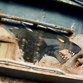
The book on Tally-Ho was first published in 1974. Human memory is fallible and the recollections of those interviewed for the book some three decades or so after the events described should not be taken as gospel. In this case they can be compared with photographic and documentary evidence. Here is an early March 1944 photo showing Tally-Ho and the damage to her caused by the Japanese propeller. She is in bright sunlight. There is a clear demarcation line on the top of the ballast tank with what is below clearly darker than what is above. Her bottom appears to have been dark rather than light: This is confirmed by her docking reports D.495 which record that her bottom was BLACK at the time, both the protective and (outermost) anti-fouling coats, not "light green". To my eye her casing and conning tower do not look likely to have been "light green" either: The terms 'light' and 'dark' are very subjective. The (genuine/contemporary) colour images and contemporary artwork I have seen of submarines in that theatre at that time (1944-45) show an olive green in use, often with a black pattern superimposed: For what it's worth I would describe the tone of the green as 'medium'. My guess is that it was one of the British Standard 987C camouflage colours, perhaps No.15 which would presumably have been readily available (but others may know more about that range and be better judges. @Jamie @ Sovereign Hobbies?).
-
 The beam of a WW2 Battleship would be a problem due to average bottle neck size, so I think this idea of a bottle with a cut off bottom to insert it might be fraught with problems, plus it would always be noticeable even if you managed to do it. A normal display case might be a better option to protect your model and possibly a lot more suited to the subject in order to view it better anyway.
 -
Jeff, you got me thinking. We never know for sure. It’s crazy, but why do we care? We could just pick a color. I mean what the hell? No one (or very few alive in this case) could really gainsay our choice. Yet we modelers want to get it right. Why? It just seems important and fitting—almost an homage. Good Lord. Who cares whether the Hood’s anti-fouling paint was red or black? We do. Now., about Arizona’s topside color at Pearl Harbor . . . Best, Jeff
- 179 replies
-
- 3
-

-
- Flower Class Corvette
- Snowberry
- (and 1 more)
-

HMS Exeter, Battle of the River Plate, Trumpeter 1/350
Marco1965 replied to Marco1965's topic in Work in Progress - Maritime
Thank you for all the positive comments, appreciate your opinion on the figures choice! I ordered a while ago the signal flags, Eduard PE, hope to get them soon and add that final detail! marco -
Hi nice model I must get around to making the ones i have in the stash but being an ex SRC devonport dockie .... i will get around to it one day cheers jerry
-
HMCS Snowberry 1/144 (Revell)
ArnoldAmbrose replied to Jeff.M's topic in Work in Progress - Maritime
G'day Jeff, I wouldn't know either, and at 1/600 is unlikely to be a concern for me. 🙂 But I'm inclined to lean towards Jon's view - a wood handle and either a red head or red bracket, something along those lines, maybe red on the handle at the operator's end. Regards, Jeff (the other Jeff 🙂)- 179 replies
-
- 1
-
-
- Flower Class Corvette
- Snowberry
- (and 1 more)
- Yesterday
-
The model of HMS Storm in the Submarine Museum looks like it is painted in a colour similar to RAF sky and a mid green.
-
 Nice preshades on the Mikasa. ⚓👍
 -
 Worth a mint those kits
 -
HMS Exeter, Battle of the River Plate, Trumpeter 1/350
bissyboat replied to Marco1965's topic in Work in Progress - Maritime
Truly a masterpiece. ⚓🙌- 141 replies
-
- 1
-
-
- HMS Exeter
- Trumpeter
- (and 1 more)
-
HMS Havock 1893 - A class Torpedo Boat Destroyer
Courageous replied to Steve D's topic in Work in Progress - Maritime
I can only echo what others have said...fantastic work on those guns, works of art. Stuart -
HMS Exeter, Battle of the River Plate, Trumpeter 1/350
Courageous replied to Marco1965's topic in Work in Progress - Maritime
Stunning work with great detail. Love the addition of the figures. Stuart- 141 replies
-
- 1
-
-
- HMS Exeter
- Trumpeter
- (and 1 more)
-
1/350 IJN Kongo - Battleship/Battlecruiser Fujimi
Courageous replied to Tegethoff's topic in Work in Progress - Maritime
Tidy work there. The replacement funnel tops look rather nice. Stuart -
It's not really surprising that the existing colour in 1944(?) differs from that described in 1939.
-
Thanks for the reply, Jamie. The book states this "slime green" was the standard camouflage color for that theater. Later in the book one officer who observed the damage to Tally Ho by a Japanese ship's propeller stated the light green color made it look like shredded lettuce. That doesn't sound like a "dark olive colour". I guess there is no official record of this color since it was mixed to fit the operational needs of the theater. I will try to improvise accordingly. Doug
-
What do I know Rob
-

New Ship Related Releases
Jagdtiger1 replied to Chris Hewitt's topic in General Maritime modelling chat
. -
Foremast. I've replaced the bottom yard with brass. Just a coat of paint to go.
-
Thanks @robgizlu and @Faraway! Your posts reminded me that there is a very thorough walk-through of the Sackville here on Britmodeller in color. I found a clear pic of an axe: handle is varnished natural wood, axe head is very dark gray or black, and the mounting brackets are red. I understand that that color scheme might be in keeping with modern safety regs, but it seems a safe enough choice. And, as Rob pointed out, there are, sadly, very few who could truly say now. Thanks again, Jeff
- 179 replies
-
- 2
-
-
- Flower Class Corvette
- Snowberry
- (and 1 more)
-
My eyes, my eyes...............Brass...................brass........................brass..................
-
Waiting for the paint to dry on the davits, I've made a start on the masts. I was going to make them out of brass, but have decided to use the plastic ones, and add the PE I have to them. It should work The first bit is one of the platforms. With a bit of bending, and prayers to The Great God : Sod may he keep well away from my workbench. I have achieved this, but of paint touchup, but acceptable.
-

HMS Havock 1893 - A class Torpedo Boat Destroyer
Dmitriy1967 replied to Steve D's topic in Work in Progress - Maritime
I don't think the ship's crew had such screwdrivers. 🙂 -

HMS Havock 1893 - A class Torpedo Boat Destroyer
Steve D replied to Steve D's topic in Work in Progress - Maritime
I'm guessing, a very small one, watchmakers used these, I have a couple with blades less than 1mm across -
HMS Exeter, Battle of the River Plate, Trumpeter 1/350
Rich75 replied to Marco1965's topic in Work in Progress - Maritime
Wow, that's beautiful! the detail you put into it is stunning, well done, like the comparison with Graf Spee too- 141 replies
-
- 2
-
-
- HMS Exeter
- Trumpeter
- (and 1 more)


.thumb.jpg.b4a5069fd2c2dd5708ce1694345c5b11.jpg)


-
Forum Statistics
239.4k
Total Topics4.1m
Total Posts -
Member Statistics
34,554
Total Members3,626
Most Online
-
Who's Online 144 Members, 2 Anonymous, 1,192 Guests (See full list)
- Pete1961
- exdraken
- Captain Glumbo
- Ratch
- Windy37
- Eric B.
- STROP
- Findo2
- Homer
- robstopper
- davecov
- PhantomBigStu
- Nigel Bunker
- ArnoldAmbrose
- Rob Pulham
- Spookytooth
- Enzo the Magnificent
- Rakovica
- azscearsy
- psdavidson
- Southern_northerner
- Werdna
- Ologist
- bentwaters81tfw
- Steve McArthur
- MOK61
- whitestar12chris
- Chimpion
- HPoirot
- bettymoo
- Rando
- GRK
- delide
- Pfeil
- Karearea
- Vincent Formosa
- Zigomar
- Armchair
- dambuster
- Saeran
- vangos
- ABeck
- Dmitriy1967
- Archelaos
- keefr22
- Ozzy
- Marcin Wojciechowski
- raider of the lost part
- Chris Thomas
- MACALAIN
- Peter Wagner
- Kitsticker
- Robin-42
- Fritag
- Flyingdutchman
- Zagor
- The Keeper
- JackG
- NealParkes
- Heather Kay
- Tim Reynaga
- mylo66
- PATRICK FROM THE SANDS
- boom175
- Mattp7999
- YorkshireT
- Tegethoff
- dragonlanceHR
- RC Boater Bill
- noelh
- Jimbo
- Neil wharfe
- TheKinksFan
- Dave Swindell
- Pin
- 'V'
- David Womby
- billn53
- Billy54
- Richard123
- GStreet
- FinnAndersen
- Skyf24
- Andy H
- elanman
- Dmitry Stelmakh
- npb748r
- Lightningboy2000
- franky boy
- kelly9mm
- P9498
- oobie1
- Rupert
- Norseman 3:16
- Mascota
- Columbia20713
- aidy
- Galligraphics
- Turbofan
- crvena petokraka
- 72nders
- Farmer matt
- Arie Vos
- Jirka Bures
- Piotr Mikolajski
- RedBarron
- IanC
- ajwebb
- paulsbrown
- Elias
- Boscombe73
- RAF4EVER
- detail is everything
- danbuoy
- AGW
- Watto
- Spooky56
- LansVVS
- drake122
- Redstaff
- Ka-Efka
- Eric Mc
- Hunter Rose
- Kingsman
- Bat21man
- FatFlyHalf
- foeth
- ivoPV
- fourthbranch
- jumbojock
- vSTAMPv
- GordonM
- Milos Gazdic
- Redboost
- Hornet133
- Biggles87
- zegeye
- Richard E
- Caerbannog
- Nenad Ilijic
- Derek_B
- Giorgio N
- rickpeck
- Drakendk