maltadefender Posted November 5, 2010 Share Posted November 5, 2010 (edited) Hi all, After completing my fictitious Fokker Dr.I a decade after it went into the loft, I've decided to give it some friends to play with. Hopefully they'll make a nice set in the weeks and months ahead, and give me the confidence to do some smaller, fiddlier biplanes in due course. Here's the fictitious Fokker with its hand-painted finish: I've got another Triplane that's going to be a straight OTB build of the Richthofen 425/17. You can't really have a WWI collection without one of the Rittmeister's aircraft in it, so having learnt a lot from my first one hopefully it'll be plain sailing. For the Sopwith Camel I wanted to go 'off-piste' rather than just build yet another Roy Brown model, and following a hunt for inspiration I discovered a pilot who clearly shared my enthusiasm for Charlie Chaplin - enough to have aluminium charicatures made and screwed to the cockpit coaming for good luck! Captain Arthur H. ‘Harry’ Cobby, DSO, DFC and Bars, was a Flight Leader with 4 Squadron of the Australian Flying Corps in 1918 - racking up 29 kills without the loss of a single member of his flight through enemy action. Numerous incidents filled his front-line career, not least having to do a ‘touch-and-go’ landing on an enemy airfield which he had just bombed and strafed! It seems that Cobby was quite a card, and as well as the Chaplin figures he added a pair of British railway carriage signs to his Camels, which were stolen during some high-jinks in transit, one reading ‘Please do not spit’ and the other reading ‘It is dangerous to lean out of the window’. I've had a go at designing and printing a couple of signs and Chaplins, which I will probably print onto card and superglue in place. I'll need to simplify the Chaplins a bit, but I'm quite pleased with the signs! cmatthewbacon has given me some clues on fettling the wings to sit properly, and so the final part of the job - beyond painting, building and rigging it to a reasonable standard! - will be making my own decals. I've ordered some decal paper and designed the 'A' identification letter so at least there shouldn't be any more dodgy brush-painted signwriting going on! These should be fairly straightforward. Famous last words... The final one of these will be the Spad XIII. Making the decals for the Camel will hopefully be good practice as I want to build this one as Georges Guynemer's final aircraft, S.504. I've got the basis of the roundels together and will probably hand-paint the fuselage band and rudder tricolore, leaving me to find as close a match as possible for the different styles of '2' used, the serial and whether or not this aircraft ever carried Guynemer's 'Vieux Charles' inscription. All good fun, more to follow over quite some time to come... Edited January 4, 2011 by maltadefender Link to comment Share on other sites More sharing options...
Ray S Posted November 5, 2010 Share Posted November 5, 2010 Hmmm, very interesting and I look forward to seing this progress. He had a sense of humour! I liked the Triplane by the way. Ray Link to comment Share on other sites More sharing options...
maltadefender Posted November 5, 2010 Author Share Posted November 5, 2010 Hmmm, very interesting and I look forward to seing this progress. He had a sense of humour! I liked the Triplane by the way.Ray Thanks! Another good Cobby incident seems to have been at the ANZAC victory parade in London, for which he was supposed to have led a low pass. It seems that he got carried away with the 'low' part and found himself caught between the heads of the marching Diggers below and the network of telegraph cables, tram wires and street lamps above. Net result was that he had to 'thread the needle' all the way down the full length of The Strand before rocketing up out of there in Trafalgar Square. 1 Link to comment Share on other sites More sharing options...
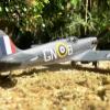
maltadefender Posted November 5, 2010 Author Share Posted November 5, 2010 Here's Cobby and a profile of the Camel... And here's a profile of S.504 - although I try not to put too much faith in a profile! Link to comment Share on other sites More sharing options...
maltadefender Posted November 10, 2010 Author Share Posted November 10, 2010 (edited) I've been fondling the plastic, trying to summon up good and kind spirits (or summat). Anyway the best news I've had all week has come from Herr Revell, who kindly put a French set of decals in the Spad XIII reissue. Not Guynemer's but the roundels and rudder stripes are good to go, which means I just have to design a set of '2' decals that look roughly like the real thing and then the stork. Decal paper arrived from themodelcatalogue - splendid fellows they are too. I see that the French started putting linseed into the clear dope in early 1917 which gave factory-fresh Spads quite a yellow finish that only faded to buff with time - that's good as it suits my paint box. S.504 was still fairly new when Guynemer was lost, so she'll be all bright and sparkly and yellow-tinged. Once I've polished off the last couple of Malta builds for the time being I'll get cracking. The current batting order is Richthofen triplane, then the Guynemer Spad and finally Cobby's Camel, which I think will be an ascending order of difficulty/intricacy. It'll all be over by Christmas. Hmmmm... my second triplane comes with extra decals for the red/white Rabe machine. Maybe I could justify another kit... but then... no, no I can't... Edited November 10, 2010 by maltadefender Link to comment Share on other sites More sharing options...
maltadefender Posted November 12, 2010 Author Share Posted November 12, 2010 (edited) Blimey! I feel a bit like Harry Potter at the moment, dear reader, catching my breath having just slammed the door on some dark and nameless menace. The reason for this state of affairs was a little research into the correct shade of red for my Richthofen triplane. In my mind's eye I've always leaned towards a rich shade, not too far shy of a good claret. With the wonder of the Internet I thought I'd have a look and see if anything less ethereal had been deduced in recent years. What I found was about 40,000 threads on one particular WWI aviation forum with lots of American people shouting at each other. Depending upon whose view you might wish to take in these debates, Richthofen's all-red triplanes were either painted in his chosen colour by Anthony Fokker personally, delivered to France in clear-doped linen and painted by 40 French maidens or they rolled off the production line in the standard scruffy, streaky Fokker colours and then hopped about the delivery park like Herbie in The Love Bug until somebody took notice and painted them an appropriate colour. Variations of all these views were then put forward, backed up with identical photographs in every case, and then the name-calling began for page after bewildering page. I know that we can occasionally get a bit heated on this forum about matters of hue and pattern, but this was extraordinary stuff. Terrifying, actually. And after I read it all I sat back and realised that none of these hundreds of pages of furious debate had actually got me any closer to answering the question of what shade the aircraft was. Then I found a reference to Peter Jackson's museum in Kiwiland, where his Richthofen collection is on display. This includes bits of fabric from 425/17, a number of the original silver cups that the man himself commissioned after many of his kills (including Lanoe Hawker's) and even clothes worn by other family members. How's that for stalking? Impressive stuff I'd have said. All the more so because when he wasn't using his supercomputers to simulate the battlefields at Helm's Deep, our benevolent movie maestro was analysing photos and bits of old cloth to perfect a full-scale diorama of Richthofen's crash site. Having got his fabulous WWI aeroplane factory to build and wreck the Fokker appropriately, and then computer-simulated the faces of his staff into the figures, the results of what must be the most expensive diorama in the world are now on display at his museum. And what was the final, painstaking result of all this deduction of Richthofen's paintjob? Red. Plain old red. No streaky bits underneath, precious little variation of tone... just red. Here's a picture... And on we go... Edited November 12, 2010 by maltadefender Link to comment Share on other sites More sharing options...
Work In Progress Posted November 15, 2010 Share Posted November 15, 2010 Maltadefender I can easily sympathise with your bemusement at the emotional forces unleashed by these matters. Peter Jackson's judgement on this issue is good enough for me so that's a weight off my mind, because I was just mulling over what to do with my little clutch of 1/72 Fokker triplanes. Now I'll do one of them solid bright red, just like the popular stereotype, and if anyone asks I'll say it's a model of the one that PJ's folk built for the diorama, before they crashed it Link to comment Share on other sites More sharing options...
T-Tango Posted November 15, 2010 Share Posted November 15, 2010 I don't know if it was the case for Richthofens' aircraft, but as regards other pilots, the aircraft were delivered in standard colours, then the pilots or mechanics painted the pilots individual markings at the airfield. Also when the Jasta received a new aircraft Richtofen would have the 1st choice and one of his old aircraft would be passed on to another of his pilots. Pete Link to comment Share on other sites More sharing options...
Nick Millman Posted November 15, 2010 Share Posted November 15, 2010 FWIW Windsock Vol.4 No.1 - an article on the hue of the red dope drawn from Wally Batter's examination of original fabric held by the Canadian Military Institute, and of colours reported in Australia and from fabric owned by Dan San Abbott. The "average" red was identified as Methuen 9(E-F)8 and where it was in pristine condition 9(C-D)8, it was identified as a "Lake Red" aka "Crimson Lake" or "Carmine Red", the notoriously fugitive pigment made from the secretion of Coccus lacca. Only quite recently have these pigments been synthesised and made stable. Variations were reported as 9F8 and 9D7 with DSA's as 10F7. Although these are different values (and useless if you don't have the Methuen guide ) they are of of similar hue, and probably much darkened with age. The article suggested Humbrol railway colour HR137 (said to be equivalent to Humbrol 132 Satin Red) toned down slightly as being a "close approximation". Couldn't find any close FS to the paint chip in the article but it is lighter than the Methuen values cited which are surprisingly dark. Richthofen was commissioned in Uhlan Regt Nr.1 Kaiser Alexander III von Russland, the uniform facings of which were, unsurprisingly, carmine red. RGB value for the "standard" pigment colour is around 150 0 24. In the 1930's Berryloid marketed a pigmented dope called "Fokker Red" which was almost identical to this deep red. Solid colour? Unlikely. They were pigmented dopes rather than paint per se and because of their transparency and brush application the appearance would be variegated and affected by the underlying dopes and materials. Link to comment Share on other sites More sharing options...
maltadefender Posted November 15, 2010 Author Share Posted November 15, 2010 Thanks chaps, At the moment I'm leaning towards a good coat of Halfords red plastic primer, putting the stencils and rib tapes on and then finishing with a thin top coat of Humbrol 60. I hope that should redden the brownish tint of the primer sufficiently without becoming too toy-like. I've just splashed a sample section of this mix on a spare Spitfire part... red primer and Humbrol 60 - what do you think? Link to comment Share on other sites More sharing options...
maltadefender Posted November 17, 2010 Author Share Posted November 17, 2010 It seems Humbrol has re-released railway paints just lately. As a result there are some contenders: RC423 Carmine: RC418 Maroon/Red: RC403 Crimson Lake: Pin the tail on the donkey time! Link to comment Share on other sites More sharing options...
maltadefender Posted November 17, 2010 Author Share Posted November 17, 2010 I've had a scout about the choo-choo sites. Crimson Lake, as used by LMS, is about what my mind's eye thought originally! As a result I'm going to first off paint the Tripe in standard finish and decal her up, then put on light coats of this rather lovely hue until we get somewhere close to this: Link to comment Share on other sites More sharing options...
T-Tango Posted November 17, 2010 Share Posted November 17, 2010 Yep, I've seen 'crimson lake' mentioned several times in different texts. Link to comment Share on other sites More sharing options...
Nick Millman Posted November 18, 2010 Share Posted November 18, 2010 (edited) (AGB members please look away now). The chip in the Windsock mag (which is actually paint) is lighter and brighter than the Methuen call-outs given in the article. The chip is an almost identical match to 9B8 which Methuen describes as just "red". The call-outs occupy a slightly darker, deeper range of colour that Methuen describe as "reddish brown". True "Lake Red" is 11A8 which they describe as "high red" or "vivid red" but which I suspect to most modellers would look far too pink and bright. I've recently been examining an original paint sample on fabric from the DH88 Comet "Grosvenor Square". In isolation it looks quite a bright red but then when compared directly with modern reds it looks decidedly dull and slightly orange or brown. So, whilst I believe the MvR colour was probably a strong red I don't think it would have been very bright. The Humbrol RC403 Crimson Lake and the last profile here look good. FWIW here are images of Berryloid's "Fokker Red" chips which are genuine pigmented dopes (not paint) from 1930's era charts. They compare well to the Methuen call-outs in the Windsock article but are significantly darker than the chip. PS The DH88 red is very close to FS 11086 - almost indistinguishable from it. Edited November 18, 2010 by Nick Millman Link to comment Share on other sites More sharing options...
maltadefender Posted November 18, 2010 Author Share Posted November 18, 2010 (edited) Many thanks, Nick. Looks like we're reaching a concensus on this anyway - Crimson Lake it is! Experiments have shown that it's not the subtlest shade ever seen in terms of allowing what's underneath to show through. That sort of makes sense, as the photos of both Richthofen's all-red Dr.I machines - 425/17 and 152/17 - have a very even semi-gloss finish in contemporary photos. Later photos of 152/17 on display in Berlin between the wars show a patchier finish, possibly due to more advanced photographic equipment but also surely down to ageing of what was pretty poor quality dope/paint in the first place. According to Alex Imrie, the first reference to 425/17 being completely overpainted in red comes on April 20, the day before he was shot down. There are however two photos of her - one in maintenance wearing Maltese crosses with the red rudder, the other being the shot from when MvR visited Belle Aise Ferme aerodrome a few days before he died. No doubt 425/17 was very fresh-looking and so as a result my standard triplane finish is pretty horrible to get on to the main event: red. Ordinarily I'd be completely ashamed by my efforts but I don't think that subtelty will be rewarded once the Crimson Lake goes on top, so to have any chance of giving some depth to the top coat I've had to be a bit... mmm... primitive that I'd like. Still got to paint the white areas for the original Maltese crosses to go on, but here are the horrors which will hopefully be hidden away by the top coat soon! More to follow once the red's been applied! Edited November 18, 2010 by maltadefender Link to comment Share on other sites More sharing options...
maltadefender Posted November 19, 2010 Author Share Posted November 19, 2010 (edited) Here are last night's efforts at bedtime with the white areas added... And here's a little bit of Lake Red doping - the streaking is marginally more visible to the naked eye but still fairly well drowned! I've given the first couple of coats to the fuselage and painted the 'inverted vee' blemish behind the cockpit, now letting the Klear settle before the stencils go on. Let them dry, give it a few hours and it'll all be red by teatime! Edited November 19, 2010 by maltadefender Link to comment Share on other sites More sharing options...
maltadefender Posted November 19, 2010 Author Share Posted November 19, 2010 Everything dried much quicker than I thought it would, so here is the fuselage with the stencils overpainted. Again, not much of the streaking left on show but there is a hint of it - more so to the naked eye than in the pics. Onward and upward! Link to comment Share on other sites More sharing options...
maltadefender Posted November 24, 2010 Author Share Posted November 24, 2010 Steady progress so far but I'm pleased with it... apart from this bit. I painted the rudder Revell semi-gloss white, let it dry for 36 hours. I applied the decals, let them dry overnight. I applied decal soft, let it dry overnight. I applied Humbrol satin varnish and the whole lot bubbled up into a horrible mess. Any ideas?? I've got one spare pair of rudder decals left and don't want to run out! Thanks for all and any thoughts! Add primer first maybe?? Link to comment Share on other sites More sharing options...
Paul RH Posted November 24, 2010 Share Posted November 24, 2010 The red looks good...pity about the decals..I hope someone cn help. Link to comment Share on other sites More sharing options...
maltadefender Posted November 24, 2010 Author Share Posted November 24, 2010 Thanks Paul... perhaps the 'brown Baron' might be more fitting... although probably not as glamorous! Good job I kept the original decals from my earlier kit! This time, however, no more mistakes... Link to comment Share on other sites More sharing options...
Paul RH Posted November 24, 2010 Share Posted November 24, 2010 The colour looks ok, it looks a harder "red" to get right than I assumed...I am following this as I want to build the 1/72nd version soon. Link to comment Share on other sites More sharing options...
maltadefender Posted November 24, 2010 Author Share Posted November 24, 2010 Will be nice to see another one! If you can, get the Humbrol railway acrylic Crimson Lake. Otherwise the WW1 Red used on earlier Albatros scouts or even Hull Red would be the best matches I think. Link to comment Share on other sites More sharing options...
maltadefender Posted November 24, 2010 Author Share Posted November 24, 2010 Rudder aside, I'm pretty happy with the progress. The camera can't quite pick up the differences in tone but I'm happy with it - especially the engine cover. Here are some bits. The seat was aluminium covered in red cloth, so I've sanded some of the wickerwork away and daubed it. The floor is Dark Earth with Clear Yellow varnish. On the outside the deep crimson bled straight through the decals, so I've had to use two for each cross all round the aircraft (good old spare set!). Some touching-up to do on the engine and then hopefully building can start soon... Link to comment Share on other sites More sharing options...
maltadefender Posted November 29, 2010 Author Share Posted November 29, 2010 A few progress shots. Engine and prop before final detailing: Airframe coming together... flash helps show up the shading under the 'Richthofen red'... Eek! Close-ups don't spare a modeller's blushes do they? Oh well. Onward and upward! Meanwhile I've been researching the Spad S.XIII ready for the next build. Definitely no 'Vieux Charles' - especially as the kit comes with the rounded wingtips. This is spot-on for how it was flown by Guynemer up until pretty much his last flight. According to another pilot of les Cigognes S.504 was the first to be fitted with the extension pockets to square off the wingtips as per the later S.XIIIs, which can only just have been done before he vanished. I'll stick with it in early trim and just make a rack for the air-to-air camera on the cabane struts. Link to comment Share on other sites More sharing options...
maltadefender Posted November 30, 2010 Author Share Posted November 30, 2010 After a lot of sweating and swearing... Time for bed. Link to comment Share on other sites More sharing options...

Recommended Posts
Create an account or sign in to comment
You need to be a member in order to leave a comment
Create an account
Sign up for a new account in our community. It's easy!
Register a new accountSign in
Already have an account? Sign in here.
Sign In Now